11. MQC Report Pages
MQC provides the possibility to create user-defined trend and status charts for selected measures, i.e. base measures, derived measures, as well as quality properties, to better structure the data to be analyzed. These additional visualizations are shown on extra pages created on demand, whenever a new configuration of such charts is imported into MQC.
The User is able to define:
multiple report pages
multiple visualization charts per report page
multiple measures per chart
MQC allows:
to import a report page configuration at any time and with that to replace a previously imported configuration
to add report pages to the current analysis by importing a new report page configuration
to update already created report pages by replacing the report page configuration
Note, that imported target values will be shown on report pages only. This applies to all those targets related to measures configured by the user to be shown in a report page visualization. Showing targets for measures can be switched on or off. Refer to Target Values in MQC for more details.
11.1. Report Page Structure
All report pages follow the MQC standard layout of the MQC data pages:
a Project KPI chart on the top-left showing current data availability
an Availability Bin Distribution chart on the top-right
an Artifact KPI chart on the bottom-left showing all artifacts in alphabetical order
the configured visualizations are shown in the main area of the page.
The following picture shows an example for a user-defined page with two status charts. For the configuration refer to Figure 11.5.
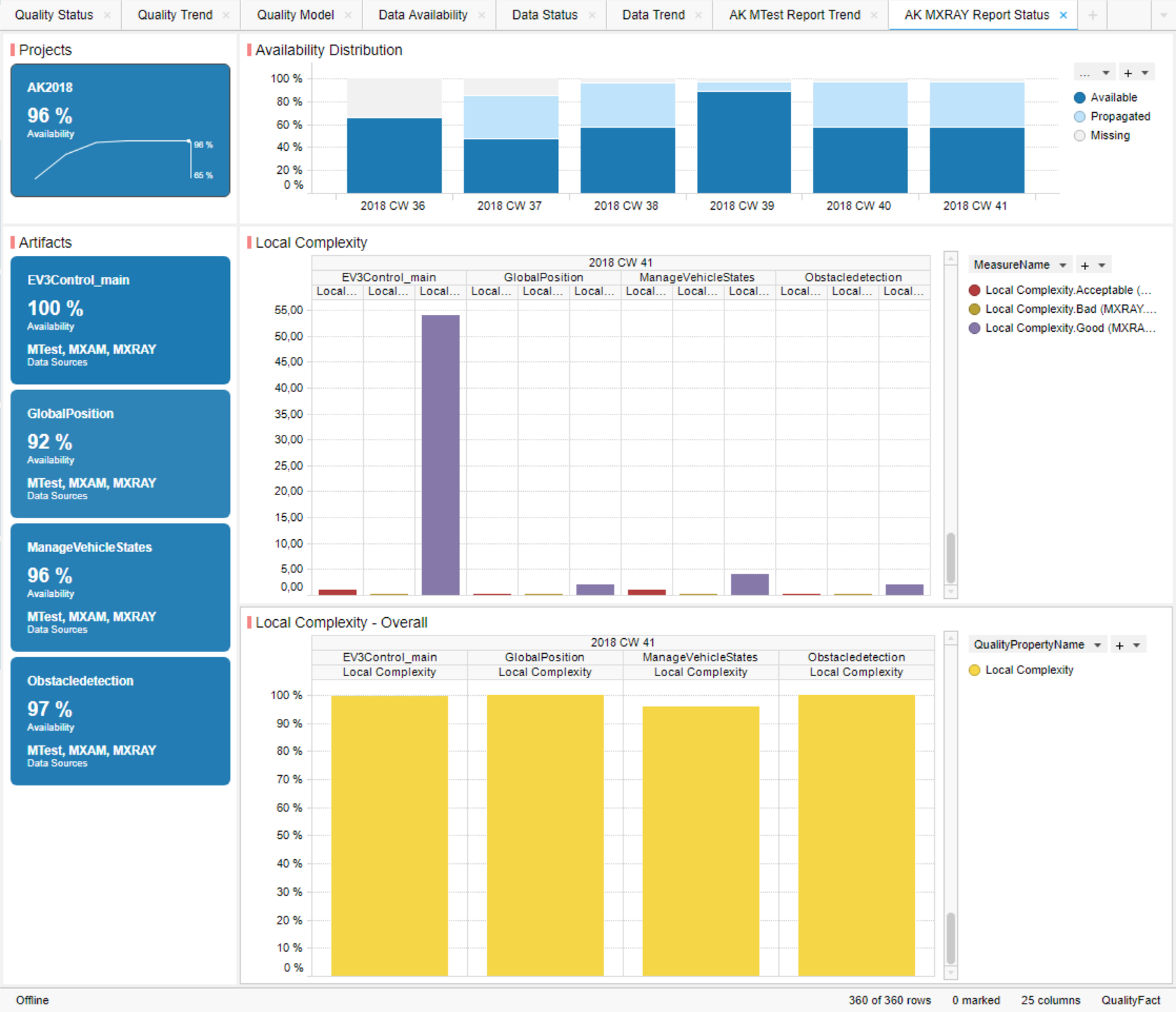
Figure 11.1 Report Page showing Status Charts for selected Base Measures and Quality Property
Status values for all or selected artifacts for one revision are shown in a bar chart.
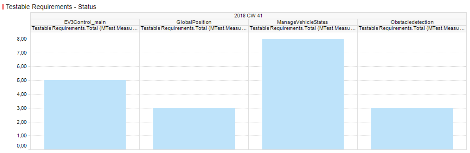
Figure 11.2 Status chart showing one status value per artifact
If multiple measures are configured to be visualized within the same chart, these measures will be shown as side by side bars per artifact.
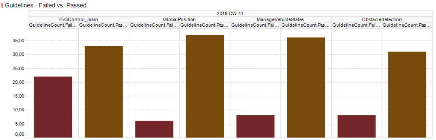
Figure 11.3 Status chart showing multiple status values per artifact
Multiple revisions are trellised, i.e. the chart always shows the measure status for one revision at a time with the possibility to scroll between revisions (see Figure 11.1).
Corresponding target values are shown as horizontal line per measure bar.
The trend over time for selected measures is shown within a line chart. Each measure trend is always shown as line over multiple revisions or as a dot if just one revision is marked by the user.
Multiple artifacts are trellised, i.e. the chart always shows the measure trend lines for one artifact at a time with the possibility to scroll between different artifacts.
If multiple measures are configured to be visualized within the same chart, one line per measure using different colors is shown at the same time for the current artifact.
Corresponding target values are shown as additional dashed line using the same color as for the measure.
The following picture shows an example for a user-defined report page with two status charts. For the configuration see Figure 11.5.
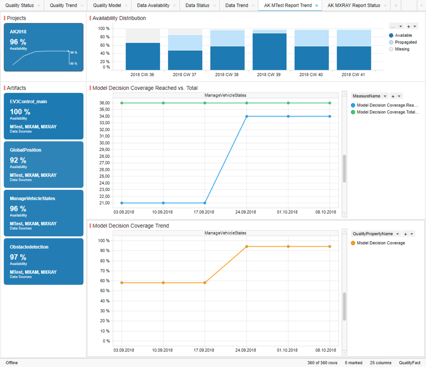
Figure 11.4 Report Page showing Trend Charts for selected Base Measures and Quality Property
11.2. Report Page Configuration
Report pages and charts are configured using Excel.
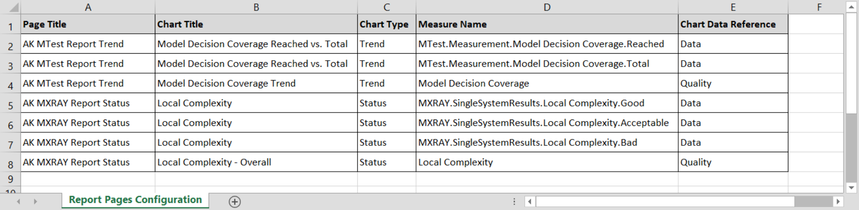
Figure 11.5 Configuration of two additional pages, each page with two charts
The configuration has the following structure:
Page Title: a user defined title for the current report page
Chart Title: a user defined title for the current chart to be shown within the current report page
Chart Type: the type of the current chart, which must be either “Status” (for status bar charts) or “Trend” (for trend line charts)
Measure Name: the full qualified name of the measure to be shown in the current chart; measure names are expected in the following notation:
Base Measures: DataSourceName.MeasurementName.BaseMeasureName.VariableName
Derived Measures: DataSourceName.DerivedMeasureName
Quality Properties: QualityPropertyName
Chart Data Reference: the type of the current measure to be shown in the current chart, which must be either “Data” (for base measures and derived measures) or “Quality” (for quality properties)
Note
It is not possible to combine different types of measures within the same chart! A chart must either contain data measures, i.e. base measures and/or derived measures, or quality measures, i.e. quality properties.
It is possible to combine different chart types (status and trend) on the same page, whereas it is not recommended. This is because of the specific marking behaviour, which is not the same for status and trend charts. Selecting a specific artifact and/or a specific revision affects all visualizations of a certain page.
11.3. Configuration Data Import and Page Creation
To import a report page configuration Excel file
ReportPagesConfig_Template.xlsx (to be found under:
C:\Users...\AppData\Local\TIBCO\Spotfire\7.X.X\Modules\MES.MQC.CoreExtension_X.X.X.X\Resources\SampleFiles\),
from the menu bar choose
and
navigate to the folder, where you have stored your configuration.
Importing a new configuration Excel file will replace any previously imported report page configuration.
After import, MQC will:
automatically create a new page for each configured report page including all configured visualizations, if a report page with the corresponding title does not yet exist
automatically replace all existing pages, where the title matches a configured report page, hence, all page visualizations of a replaced page are updated according to the newly imported configuration
Note, that MQC will not close any report page defined by a previously imported configuration, if the current configuration file does not contain a page with an identical title. Those pages have to be manually closed by the user.
Also note, that MQC will not replace any MQC Standard or Tool Page, if the configuration file contains a page with a title that matches the title of an MQC Standard or Tool Page. Instead an additional page with that name is created. Nevertheless, it is highly recommended to use dedicated names within the report page configuration file.