18. Customizing Your Project
In this chapter, we will take you through the different ways in which you can customize the visualizations provided to you. This includes adding new pages, modifying the existing pages provided by MQC, adding new visualizations, changing the layout, etc.
18.1. Creating New Pages
If you would like to view your data in a different way, you can always create a new page. To add a new page click on “Insert” tab and add “New Page” option or directly click on “+” sign indicated next to the pages. You can rename this page by right click and “Rename Page”. This menu will also give you options to duplicate, copy, export, delete, etc. the current page.
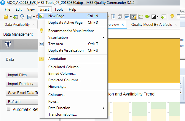
Figure 18.1 Adding a new page
18.2. Adding New Visualizations
On adding a new page, you can choose the data table, which you would like from the Configuration panel. After selecting the table from the drop down menu, you can also further drill down and select the columns that you are interested in. The selections done in the Configuration panel are applied to the entire page. Now you can add any new visualization from the toolbar as shown below.

Figure 18.2 Visualizations Toolbar
After adding a visualization, if you would like to change the table from which the data is chosen click on the “Data table” drop down menu on the visualization window. This changes the data table only for the selected visualization. You can also change the columns used for the axis for any visualization by clicking on the drop down menu at the axis or add a column by clicking on the “+” sign placed next to it.
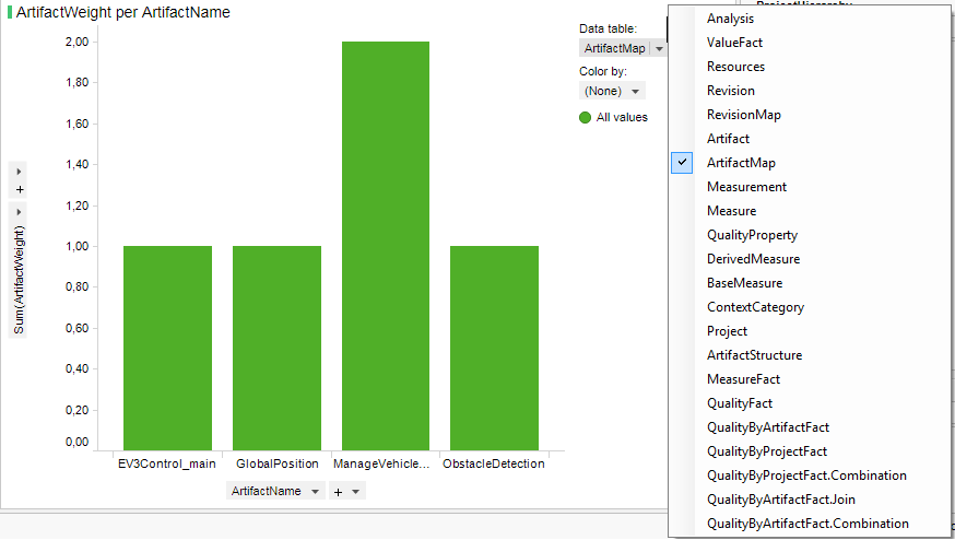
Figure 18.3 Changing data table for visualization
18.3. Switching Visualizations
If you do not like the current visualization, you can also choose to switch the visualization to another. Right click on current visualization and select ‘Switch visualization to” and then choosing the desirable visualization. In the example below, you can see the line chart being switched to the bar chart.
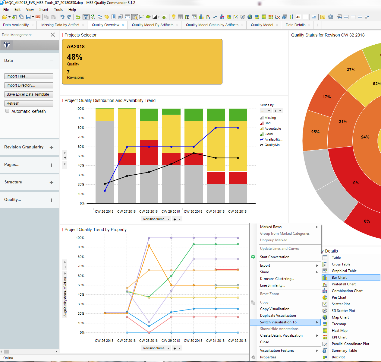
Figure 18.4 Switching visualization from line chart to bar chart
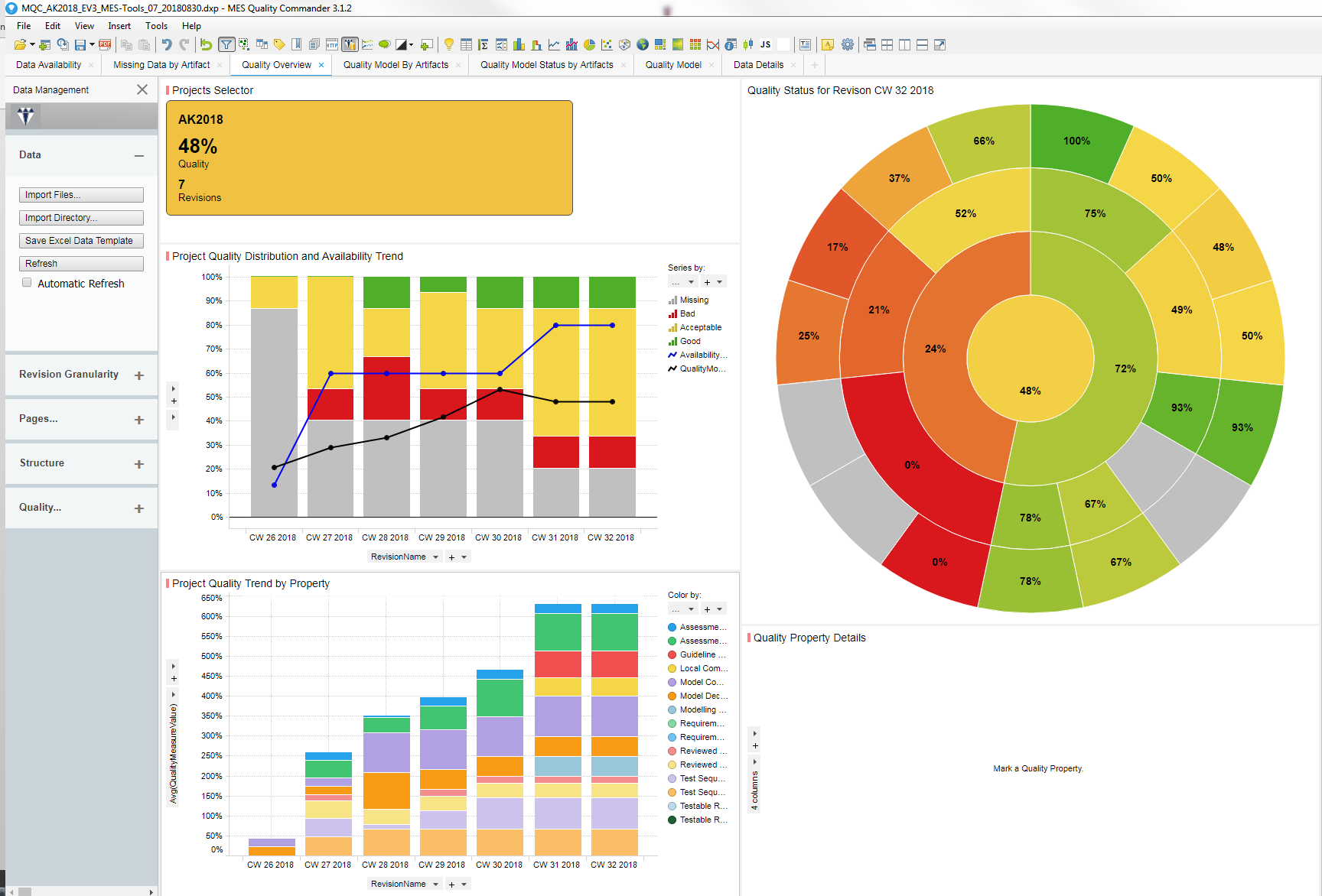
Figure 18.5 Switching visualization – page after switching the visualization
18.4. Duplicating Visualizations
If you like the current visualization and would like to duplicate it, you can right click on the visualization and select “Duplicate visualization”. This can be especially useful in visualizations, which contain multiple charts. If you would like to compare two charts in the same visualization, you could duplicate it and place them next to each other for comparison.
In the example below, you can see that the “Base measure trend visualization” is a trellis. That is it contains the trend for each of the artifacts. You can scroll through the visualization to see the trends one by one. However, if you would like to compare these trends against each other you can duplicate the visualization and compare the trends.
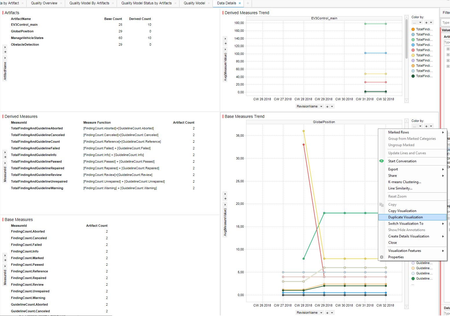
Figure 18.6 Duplicating visualization
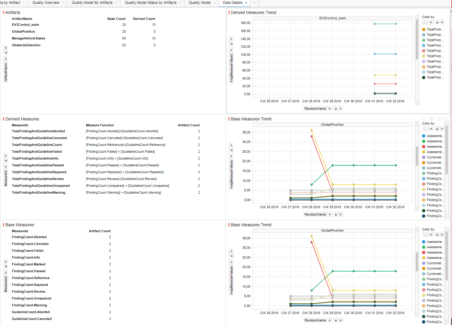
Figure 18.7 Duplicating visualization – After addition. Now you can scroll in each visualization to compare different charts.
18.5. Setting Page Layout
If you do not like the position or sizes of your visualizations you can change the layout of the page. You can choose the default options available in the tool bar like create a new window, evenly, side-by-side, stacked or even zoom the current active visualization.

Figure 18.8 Layout settings in toolbar
Alternatively, you can also drag and drop the visualizations to switch their places or align them side-by-side or stacked up. You can resize the visualization by hovering over the borders.
18.6. Changing Color
If you would like to change a specific color used in the visualization, click on the color and a color palette will be displayed to you for changing the color. At any point, if you do not like the result you can always click on the “undo” button in the tool bar to reject your changes.
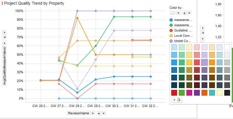
Figure 18.9 Changing color in visualization
18.7. Details Visualization
If you are interested only in a part of the data that you can see in the visualization, you can drill down and create detailed visualizations. To do this first “mark” the interesting data and right click to select “Create details visualization”. The new visualization will use only the data that you have marked before. In the example below, you can see that the details visualization of a pie chart is created from the marked data. When clicking on the pie chart, you can notice that it is created only by considering the marked data. You can now do further analysis on this extracted data.
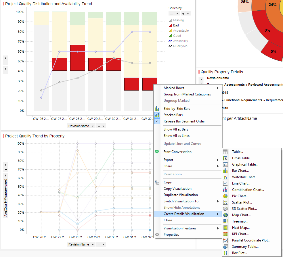
Figure 18.10 Creating details visualization – Please mark the interested data first
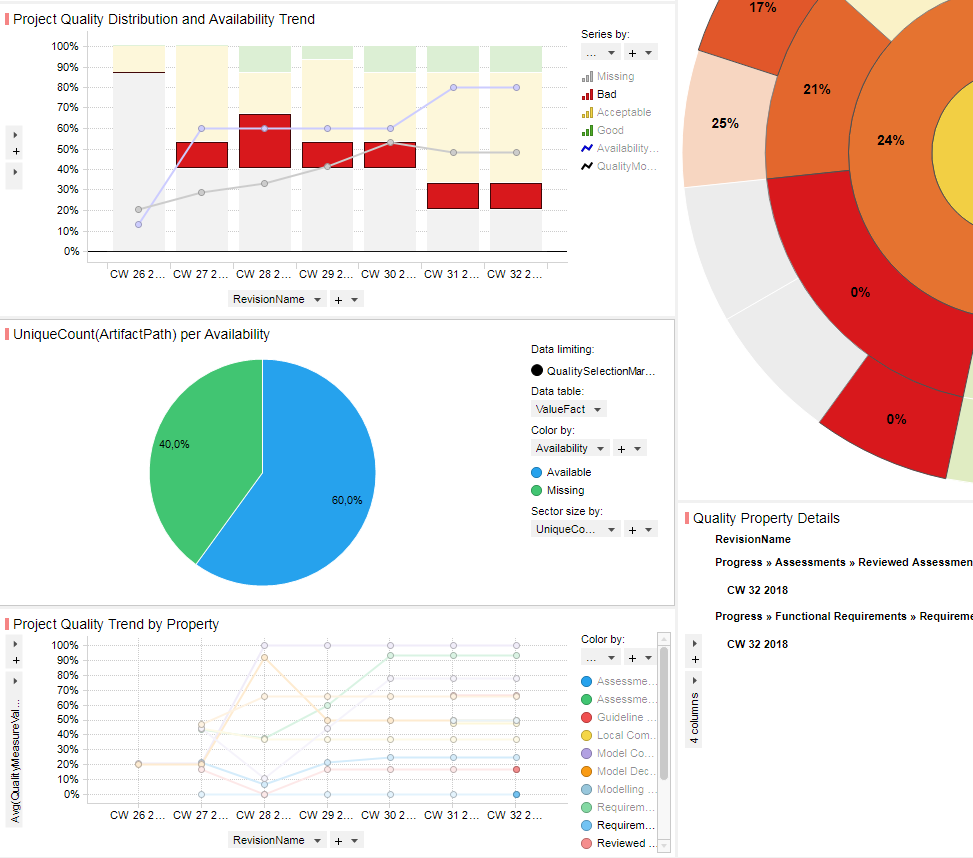
Figure 18.11 Creating details visualization – After addition of visualization
18.8. Marking
Marking is a very useful feature for analysis. Marking allows you to highlight the interesting data from the selected visualization and highlights the same or related data in the other visualizations on your page. For instance, you can mark a bar in a bar chart, a sector in a pie chart, bins in stacked bar chart, etc. You can also mark a category by clicking on the legends of a chart. If you want to mark multiple elements of a chart, you can do so by clicking “Ctrl” and selecting the elements. You will notice that on marking, the marked elements might change color or the unmarked elements get faded. Marking in one chart affects the neighboring related chart.
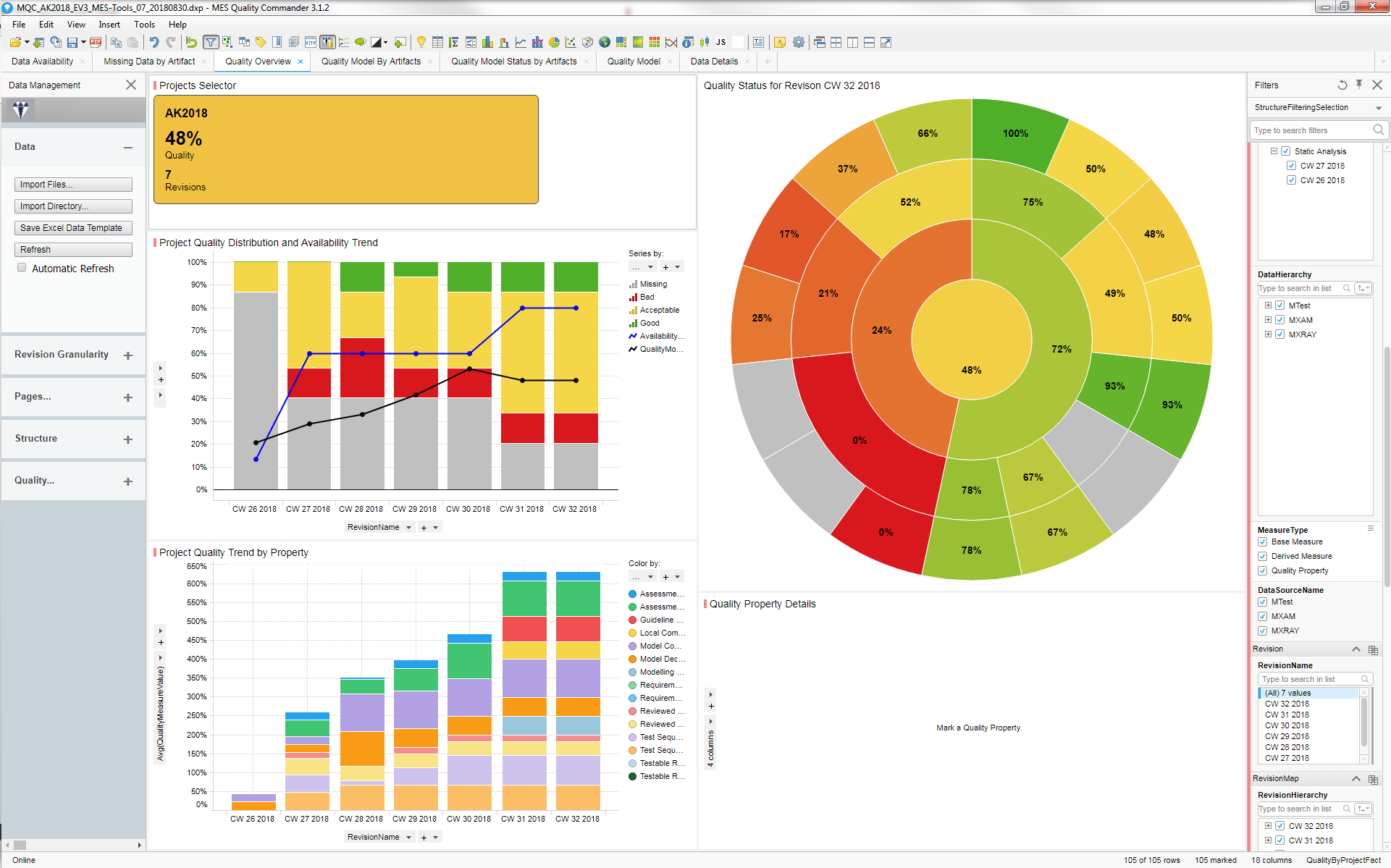
Figure 18.12 Original state of visualization
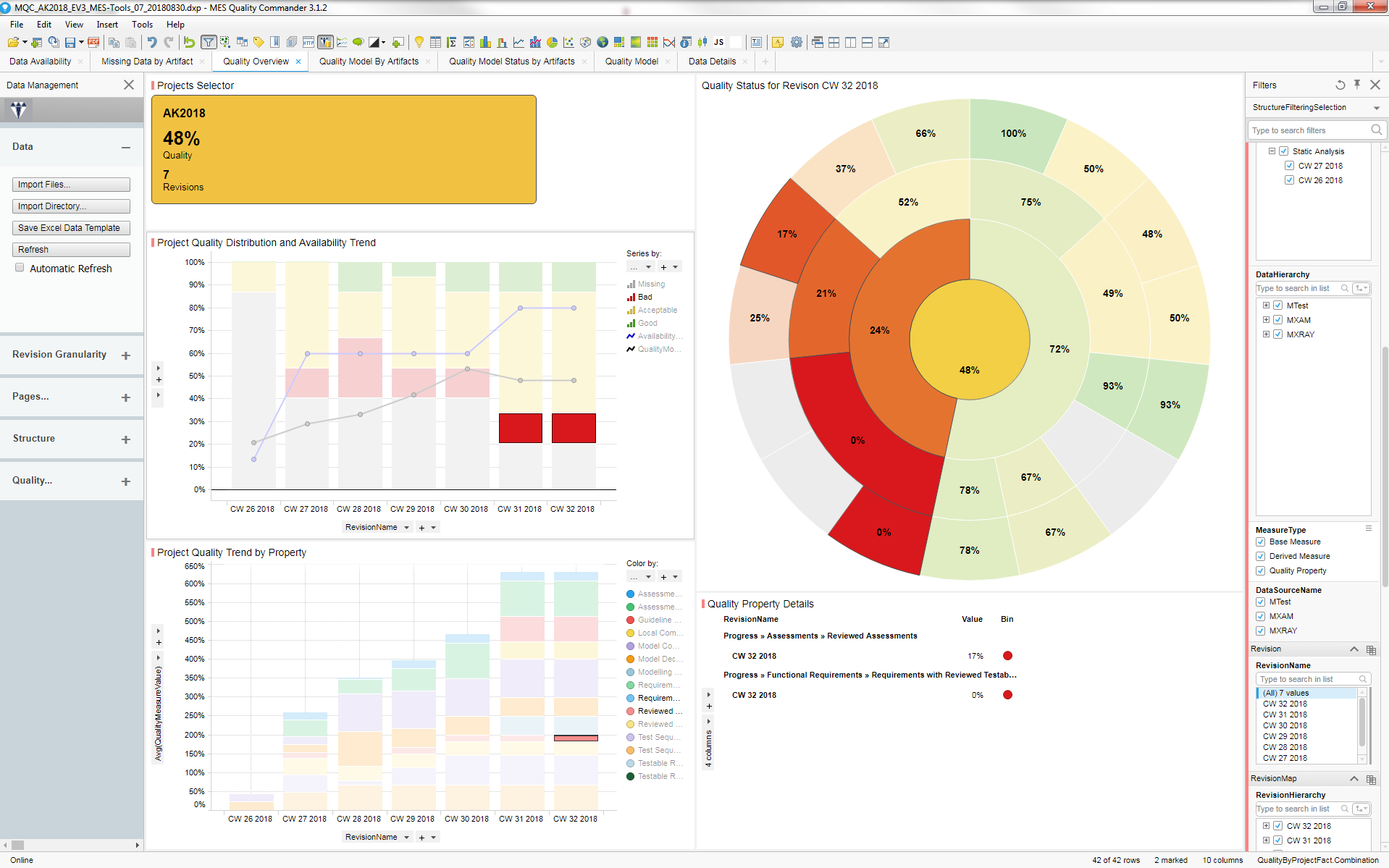
Figure 18.13 After marking in visualizations
18.9. Filtering
If you would like to reduce the data that you see, you can use the filter panel to filter the relevant data. Filtering is different from marking. Marking allows you to highlight the interesting data from the selected visualization and highlights the same data in the other visualizations on your page. However, filtering removes the data completely from the visualizations. Thus, you would like to use filtering to remove irrelevant data or reduce any data that you can see in the visualization. To do this make use of the filter panel present in the right side of your screen. The filter panel is shown by default. To hide it, unmark the menu entry View/Filters or click on the filter button in the taskbar.
The default filter scheme provided by MQC allows you to effectively filter the ata in different ways. As previously explained, you have to define the structure of the data and the project to be imported. The structure of the quality model also must be defined. The filter panel will allow you to filter the data over these defined structures. For example, the “ProjectHierarchy” filter allows you to filter the data based on the project structure. Thus, you can select data from “Project level’, “Milestone level” or “Revision level”. “DataHierarchy ” allows you to filter using the data structure. This can have different categories of data like “MTest”, “MXAM”, “MXRAY” and any other type of data that you imported. This is broken down into measurements. The measurements are further divided in base measures, derived measures, quality properties and so on. You can also filter data based on the revisions from the “RevisionName” or “RevisionHierarchy” filter. The “RevisionHierarchy” filter allows you to choose the revisions unto the lowest level. Similarly, the “QualityHierarchy” filter allows you to filter based on the three level quality structure.
The different hierarchies used in the filters are explained in detail later in Configuration of Project Structures.
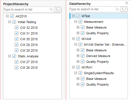
Figure 18.14 Filtering scheme provided by MQC.
You can also create your own filters, save them as filter schemes and switch between them as and when you like. Right click on the filter panel and click on “show filtering scheme menu”. This makes a drop down menu visible in the filter panel. The drop down will contain a list of available filter schemes and an option of “Manage Filter Schemes” and “New Filter Scheme”. You can create a filter scheme using this. With a right click on the filter, you can also change the filter type to one of your choice like radio button, check box, text filter, etc. You can also change the data table for the filter and customize your filter as per your choice by setting “Filter scheme properties” and save it as your own filter scheme.
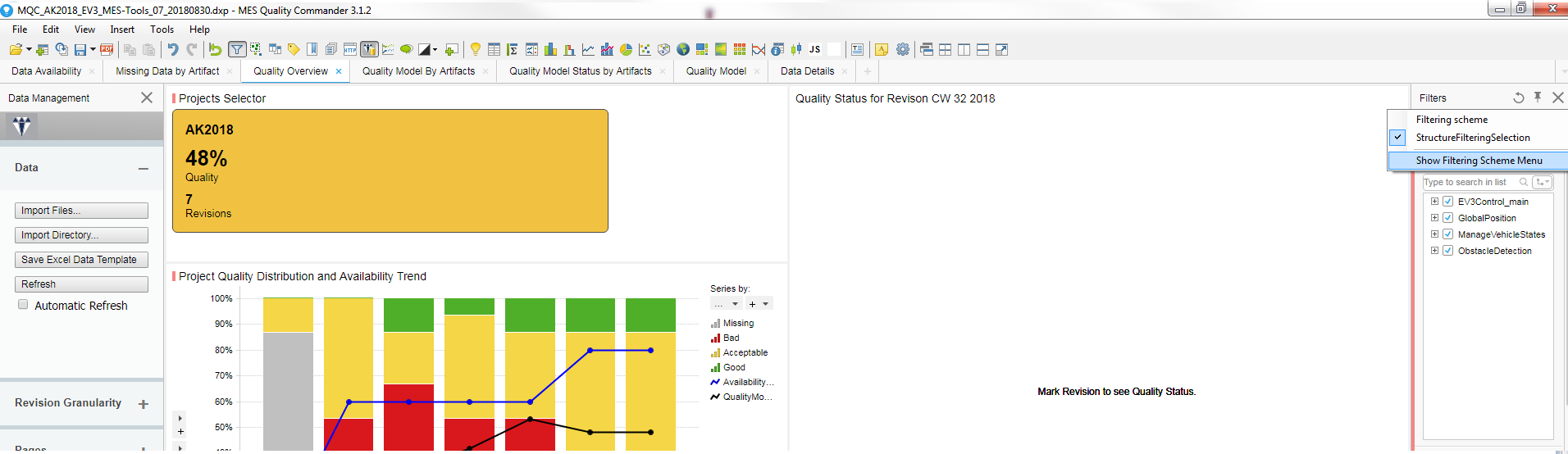
Figure 18.15 Creating new Filtering scheme (via the menu in upper right corner)
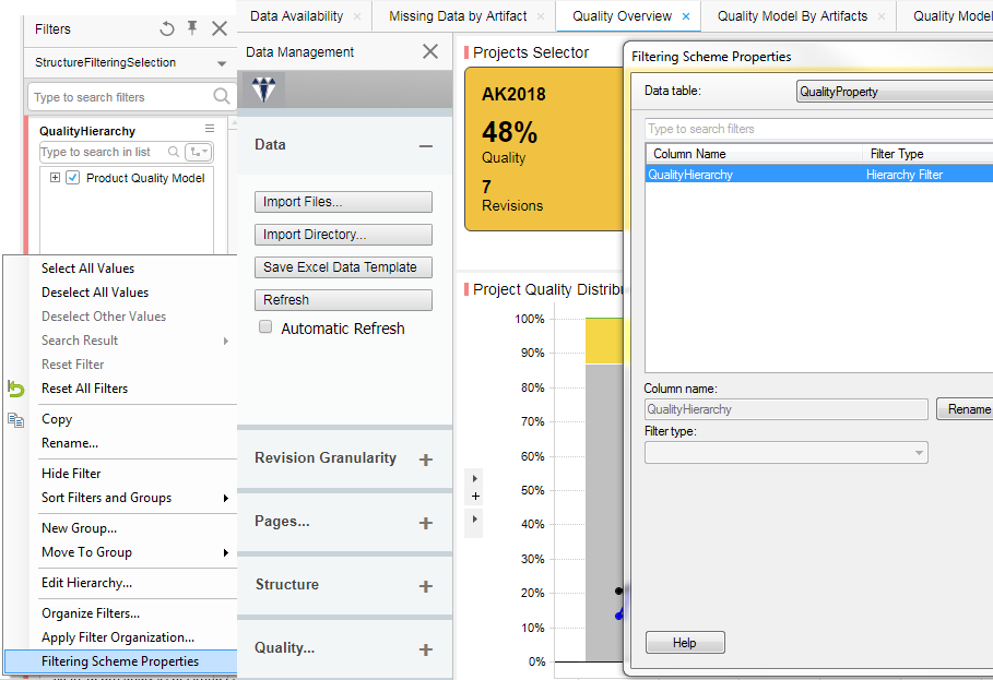
Figure 18.16 Customizing your Filtering scheme After right clicking on the Filter panel (in the lower left side) go to ‘Apply Filter Organization…’ and select the page you want your filtering adjustment to be applied to.
Please note that you can copy your customized filter scheme to any other pages of the MQC dashboard.