4.7. Pages
MQC structures all the important information of your project and shows it on different pages. Mainly, there are three kinds of pages, showing either quality, the imported data or data availability (see Interactive Pages).
On all pages the main visualization always shows one revision with the possibility to switch revisions from the dropdown menu above (see Revision Selection). By default, Everything means that all revisions with imported data will be shown. For example, if revision granularity is set to Days, days without imported data are not shown in the visualizations.
All pages contain interactive visualizations. If you click into any of the visualizations, the other visualizations will react and show information related to what you have marked (see Marking).
Based on the Project Structure you have imported, the filter panel on the right (see Filter Panel) will display options for filtering the data.
All MQC pages can be easily enabled or disabled by selecting the corresponding page in the dialog of the left-hand side panel .
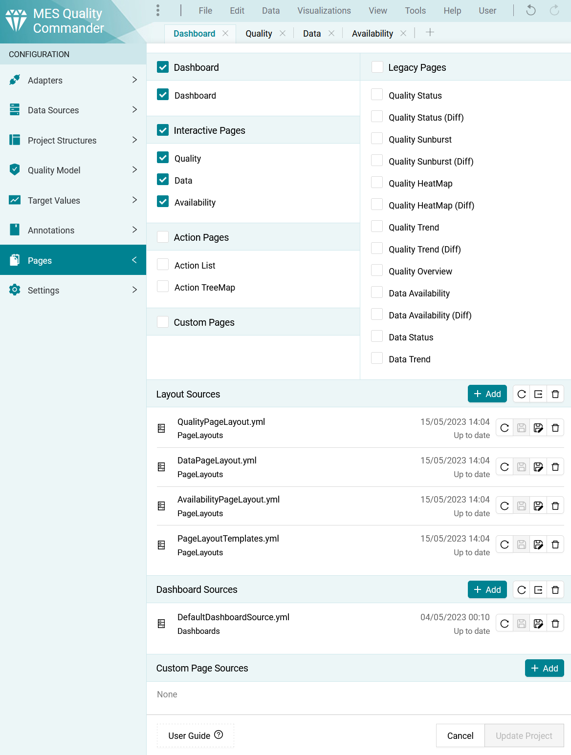
Figure 4.50 Pages dialog for page configurations
In the dialog the Layout Sources, Dashboard Sources and Custom Pages can be configured, saved and exported similar to all other configuration sources (see Configuration Sources).
4.7.1. Pages Layouts
MQC allows you to create custom page layout configurations for the Interactive pages, so you can define personalized pages that will fit your needs and only display the relevant data.
MQC is shipped with one default Page Layout Template source containing different Page Layout
definitions. The active page layouts are stored in the Page Layout sources: QualityPageLayout.yml,
DataPageLayout.yml and AvailabilityPageLayout.yml. The Template source contains the
different page Templates for one Page with given Name (e.g., for Quality named Status
as shown in Listing 4.14). You can define a custom Layout where visualizations
for the three main areas of the page: Top, Kpi and Main can be specified. For each area
Visuals can be defined with the corresponding Identifier. Which visualization should be
active is specified in ActiveVisualization by giving the Identifier of the visualization.
The source can be defined as shown in Listing 4.14.
$schema: http://quality-commander.de/userguide/v62/schema/PageLayoutSource.schema.json
$version: 1.0
Templates:
  - Page: Quality
    Name: Status
    Layout:
        Top:
          - Visuals:
              - Identifier: QualityBinTrend # Visualization tab 1
              - Identifier: QualityTrend # Visualization tab 2
            ActiveVisual:
                Identifier: QualityBinTrend # Visualization tab 2
        Kpi:
          - Visuals:
              - Identifier: QualityKpiArtifact # Visualization tab 3
            ActiveVisual:
                Identifier: QualityKpiArtifact # Visualization tab 3
          - Visuals:
              - Identifier: QualityKpiQualityProperty # Visualization tab 4
            ActiveVisual:
              Identifier: QualityKpiQualityProperty # Visualization tab 4
        Main:
          - Visuals:
              - Identifier: QualityHeatmap # Visualization tab 5
              - Identifier: QualitySunburst # Visualization tab 6
              - Identifier: QualityDataOrigin # Visualization tab 7
          ActiveVisual:
              Identifier: QualityHeatmap # Visualization tab 5
  - Page: Quality
    Name: Trend
    Layout:
        Top:
          - Visuals:
              - Identifier: QualityBinTrend
              - Identifier: QualityTrend
            ActiveVisual:
              Identifier: QualityBinTrend
        Kpi:
          - Visuals:
              - Identifier: QualityKpiArtifact
            ActiveVisual:
              Identifier: QualityKpiArtifact
          - Visuals:
              - Identifier: QualityKpiQualityProperty
            ActiveVisual:
              Identifier: QualityKpiQualityProperty
        Main:
            - Stacked:
                - Visuals:
                    - Identifier: QualityTrendByArtifact
                ActiveVisual:
                    Identifier: QualityTrendByArtifact
                - Visuals:
                    - Identifier: QualityTrendByQualityProperty
                ActiveVisual:
                    Identifier: QualityTrendByQualityProperty
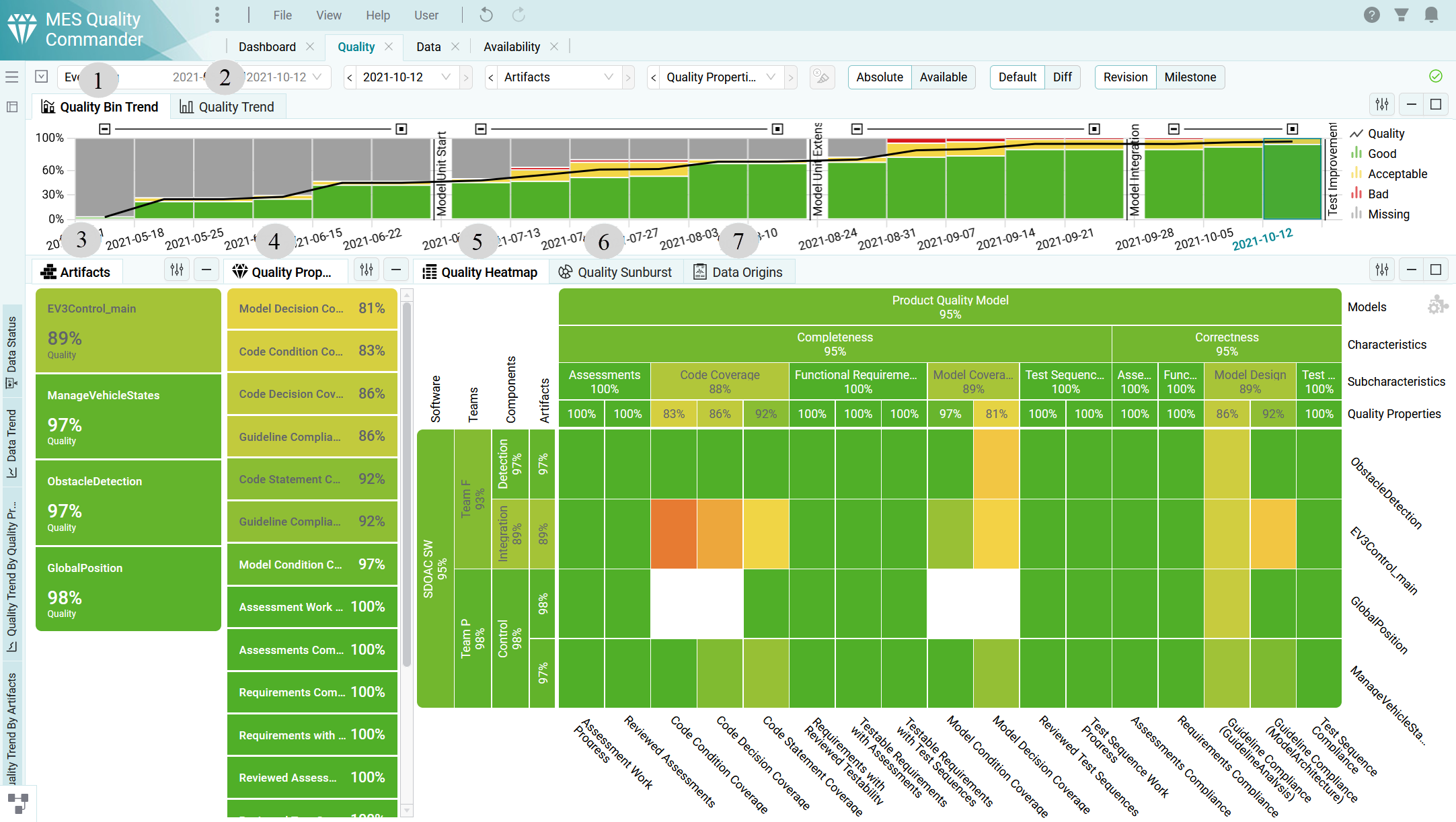
Figure 4.51 Default Quality Page
If you want some visualizations to be shown on top of each other in one area you can use
the keyword Stacked and specify the Visuals as shown in Listing 4.14.
The current Layout for a Page can be changed from the Page Layout Switcher in the left hand side (see Templates).
4.7.2. Dashboards
MQC provides the possibility to create custom dashboard page configurations. This allows you to define personalized dashboard pages that fit your needs.
To configure a Dashboard source, you need to create a YAML file in which you specify the
Authors and DashboardPages. For each dashboard page Name and Items should
be specified. You can define a visualization by adding the Visual in Items. The
Visual should contain the category and the name of the visual (e.g., Project.InformationCard).
In addition, the Position (X and Y) and the Size (Width and Height)
of the element should be defined. It is also possible to hide the title of the visualization
by setting the property TitleBarHidden to true.
The configuration can be done in YAML following the schema:
$schema: http://quality-commander.de/userguide/v62/schema/DashboardSource.schema.json
$version: 1.0
Authors:
    - Model Engineering Solutions GmbH
DashboardPages:
    - Name: 'Dashboard'
    Items:
    - Visual: 'Project.InformationCard'
        Position:
            X: 0
            Y: 0
        Size:
            Width: 6
            Height: 8
    - Visual: 'Quality.TrendLineChart'
        Position:
            X: 6
            Y: 0
        Size:
            Width: 18
            Height: 8
    - Visual: 'Data.WorstArtifactsKpiChart'
        Position:
            X: 16
            Y: 11
        Size:
            Width: 8
            Height: 5
        TitleBarHidden: true
In this way a dashboard file may be used for multiple projects as well.
4.7.3. Custom Pages
Custom pages and charts are configured using Excel.
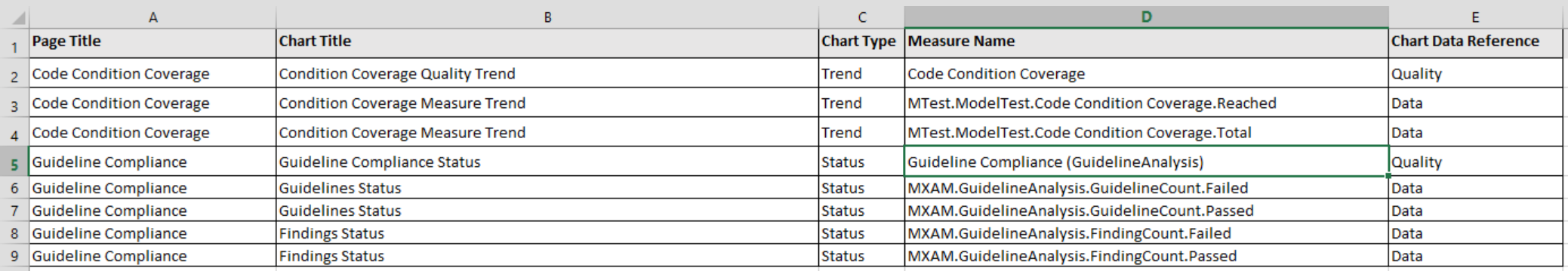
Figure 4.52 Configuration of two additional pages, each page with two charts
The configuration has the following structure:
Page Title: a user defined title for the current custom page
Chart Title: a user defined title for the current chart to be shown within the current custom page
Chart Type: the type of the current chart
use Status for status bar charts
use Trend for trend line charts
Measure Name: the full qualified name of the measure to be shown in the current chart; measure names are expected in the following notation:
Base Measures:
DataSourceName.MeasurementName.BaseMeasureName.VariableName
Derived Measures:
DataSourceName.MeasurementName.DerivedMeasureName.VariableName
Quality Properties:
QualityPropertyName
Chart Data Reference: the type of the current measure to be shown in the current chart, which must be either “Data” (for base measures and derived measures) or “Quality” (for quality properties)
It is not possible to combine different types of measures within the same chart! A chart must either contain data measures, i.e. base measures and/or derived measures, or quality values, i.e. quality properties.
It is possible to combine different chart types (status and trend) on the same page, whereas it is not recommended. This is because of the specific marking behavior, which is not the same for status and trend charts. Selecting a specific artifact and/or a specific revision affects all visualizations of a certain page.