3.2. Quick Start
One of the biggest advantages of MQC is its interactivity. The tool does not show static graphs. Instead, the information provided by each visualization will adapt according to the actions of the user. It is possible to focus on specific details as well as to arrange visualizations conveying different aspects next to each other to get a better picture of a project.
In the following, some of the main use cases when working with MQC are described.
3.2.1. Check the availability of the expected data
The data availability as shown on the Availability page acts as a first indication of how the project is progressing.
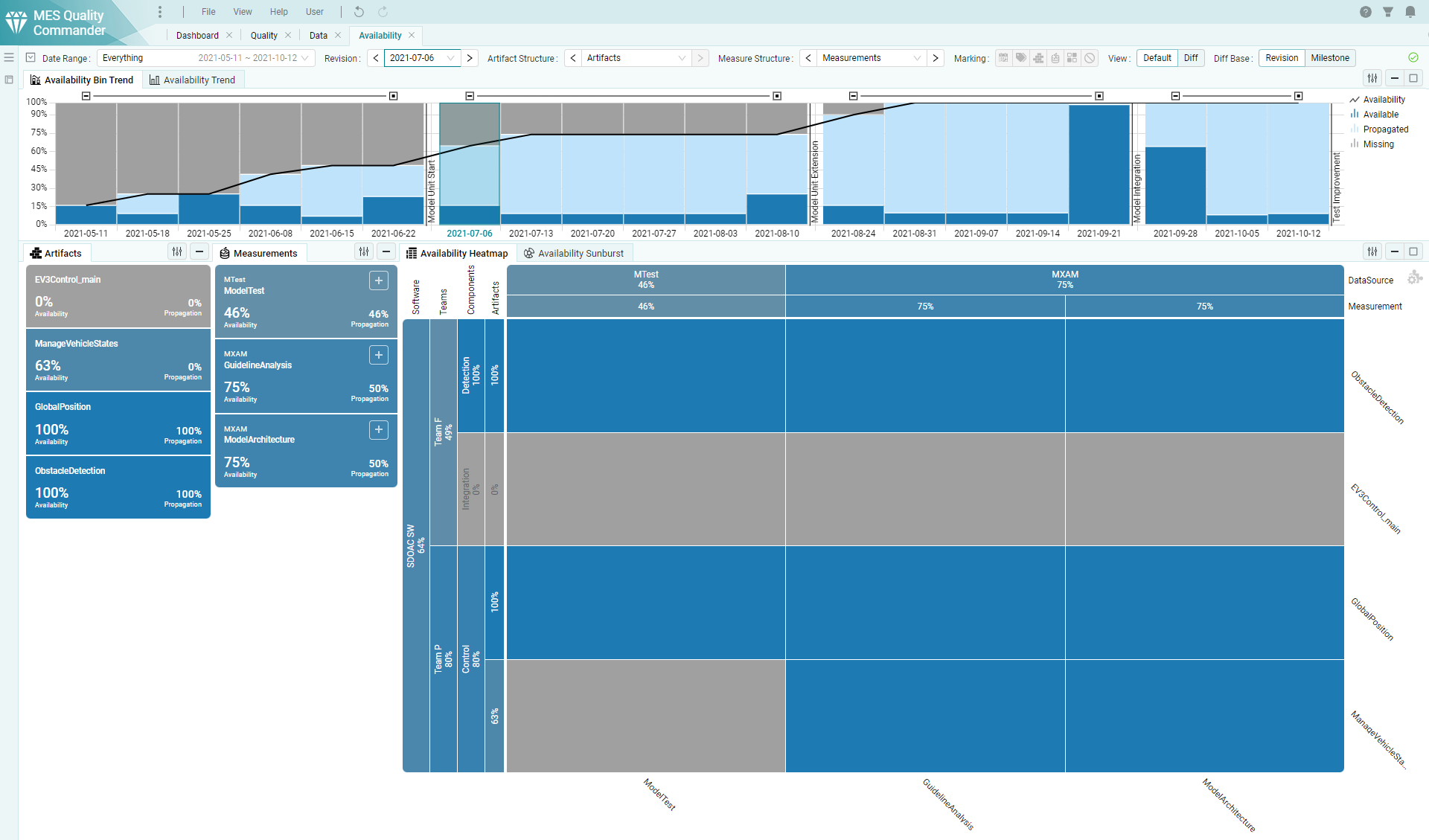
Figure 3.4 Check the availability of the expected data on the Availability page.
Grey areas inside the Availability Heatmap (see Figure 3.4) are depicting, which of the expected data for the expected artifacts is still missing. That may point to not yet available data reports respectively it may be an indicator for not yet executed tasks, especially in a very early phase of the project.
Missing data leads to missing quality, which has an impact on the overall quality of the project, because per default missing quality is treated as 0%.
Data that was available in previous revisions can be used in later revisions as well until it is replaced with data from a newly created report, e.g. after a test re-execution.
In MQC this is called data propagation (see Data Propagation). Propagated data is indicated by a light-blue color as shown in the Availability Bin Trend chart on top of the Availability page.
3.2.2. Check the current quality status
One of the most important information about a project is the actual current quality status. Quality in MQC is calculated based on the data read from the available reports as described in detail in Computation.
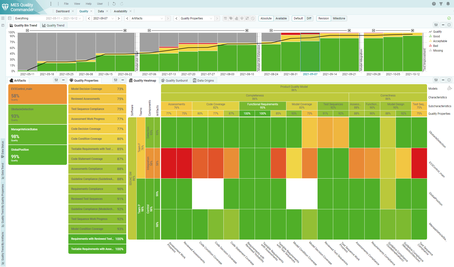
Figure 3.5 Check the actual quality status of the project on the Quality page.
MQC shows a quality value per artifact and quality property (see Figure 3.5) as well as aggregated on several levels, for instance the quality for groups of artifacts and/or specific quality characteristics as defined in the underlying quality model according to ISO-25010 (refer to Structure).
MQC initially uses a traffic light coloring scheme to visualize the computed quality. Having green for good quality and red to depict that quality is bad, makes it easy to detect problems, i.e. parts of the project with insufficient quality.
3.2.3. Check the quality progress of the project
Besides the status, the quality trends (as well as data trends) provide further useful information.
Based on the development of the quality measures over time as shown in Figure 3.6, and especially in combination with milestones and expectations (i.e. targets), it is possible to derive a prediction about the project progress. Areas with an increased need for action can be easily identified.
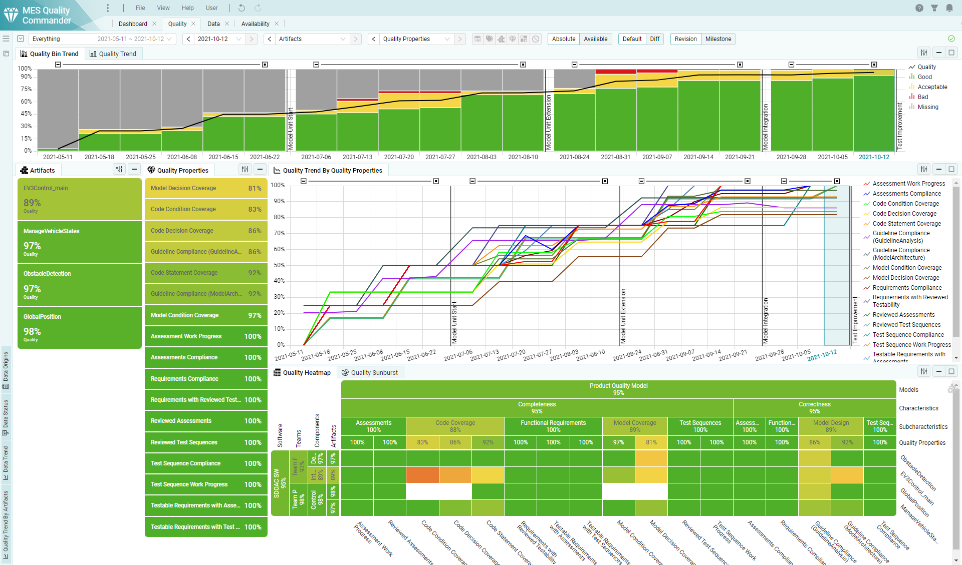
Figure 3.6 Check the quality progress of your project on the Quality page.
Trends in MQC are shown for various items, like artifacts and quality properties, as well as aggregated on different levels.
Find more information about how to add visualizations to a page or how to switch between different visualizations in Interactive Pages.
3.2.4. Check for areas with poor quality
Due to the traffic light color schema used in MQC, areas with poor quality can be easily detected. Focusing on such areas is possible by the Marking functionality (see Marking).
In case of quality issues have been identified, the tracing functions provided by MQC may be used to gather more specific information about these aspects, for instance by checking the underlying data that was used to calculate the corresponding quality measures, as it is shown in Figure 3.7.
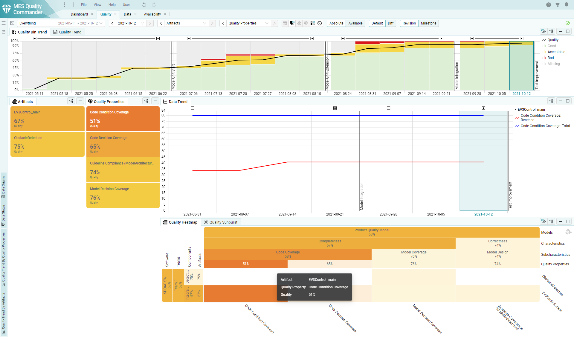
Figure 3.7 Check the data that was used to compute poor quality.
Find more information about how to add visualizations to a page or how to switch between different visualizations in Interactive Pages.
3.2.5. Check what has been changed
With MQC, it is possible to easily compare the current status of quality or data availability with, for instance, the status of the previous revision.
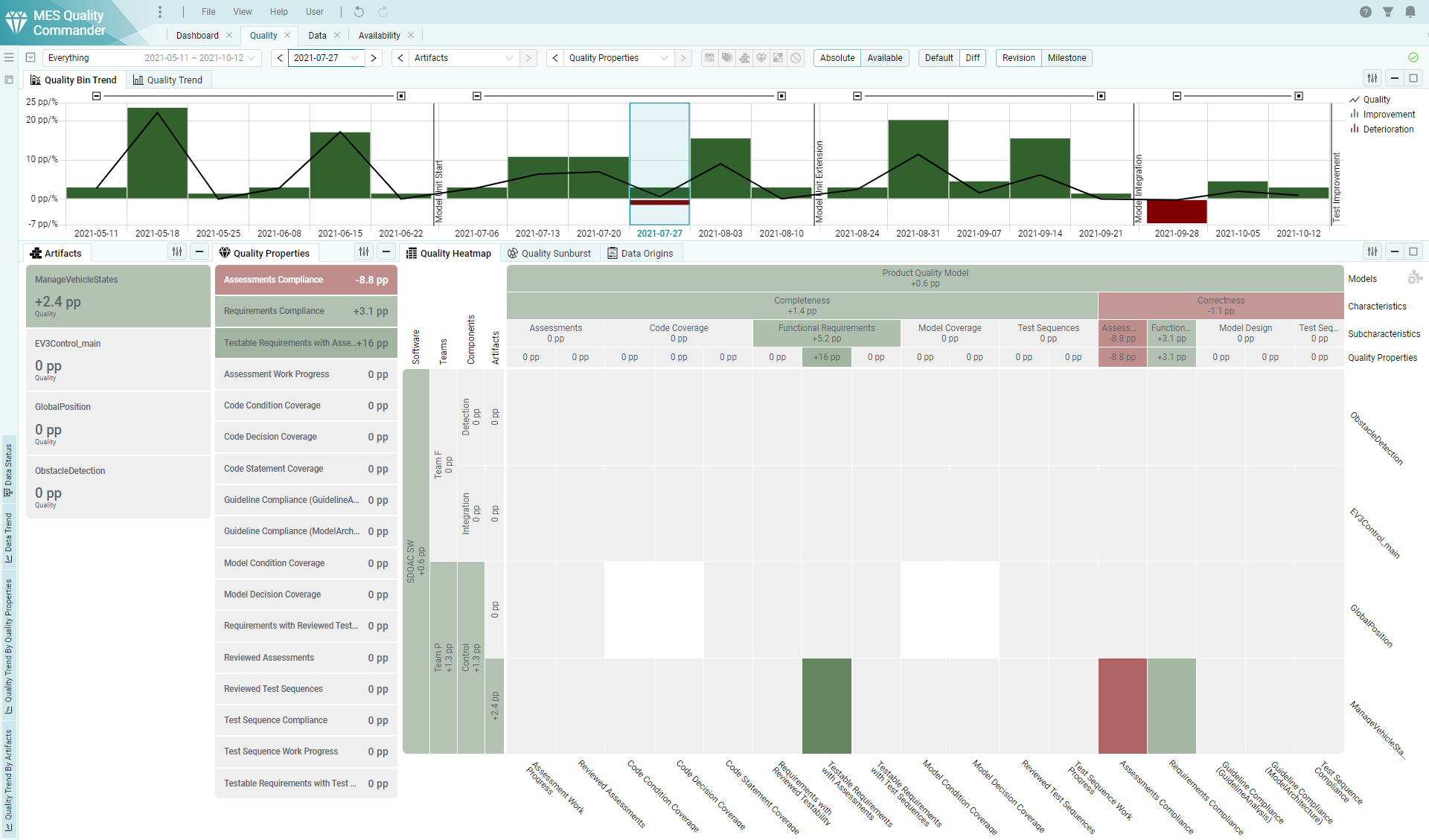
Figure 3.8 Use the diff view to compare the current status of e.g. quality against the status of a previous revision.
As shown in Figure 3.8, this provides a detailed view of what exactly has been changed. Especially in the case that the overall quality of the project stays the same, the diff view per artifact and quality property may show improvements of the same magnitude as deteriorations in other aspects of the project. Thus, identifying and focusing on problematic areas is facilitated.
The view mode can be changed for all visualizations or for specific visualizations only. See Views (Diff mode) on how to switch the current view mode.
3.2.6. Check the data origins of problematic quality measures
As depicted in Figure 3.9, MQC is not just able to show the underlying data, which was used to compute problematic quality measures, but also to open the reports the data initially was read from.
By that, with a single click, it is possible to directly analyze specific details down to the root cause of a problem instead of manually searching inside a high amount of possibly relevant report files.
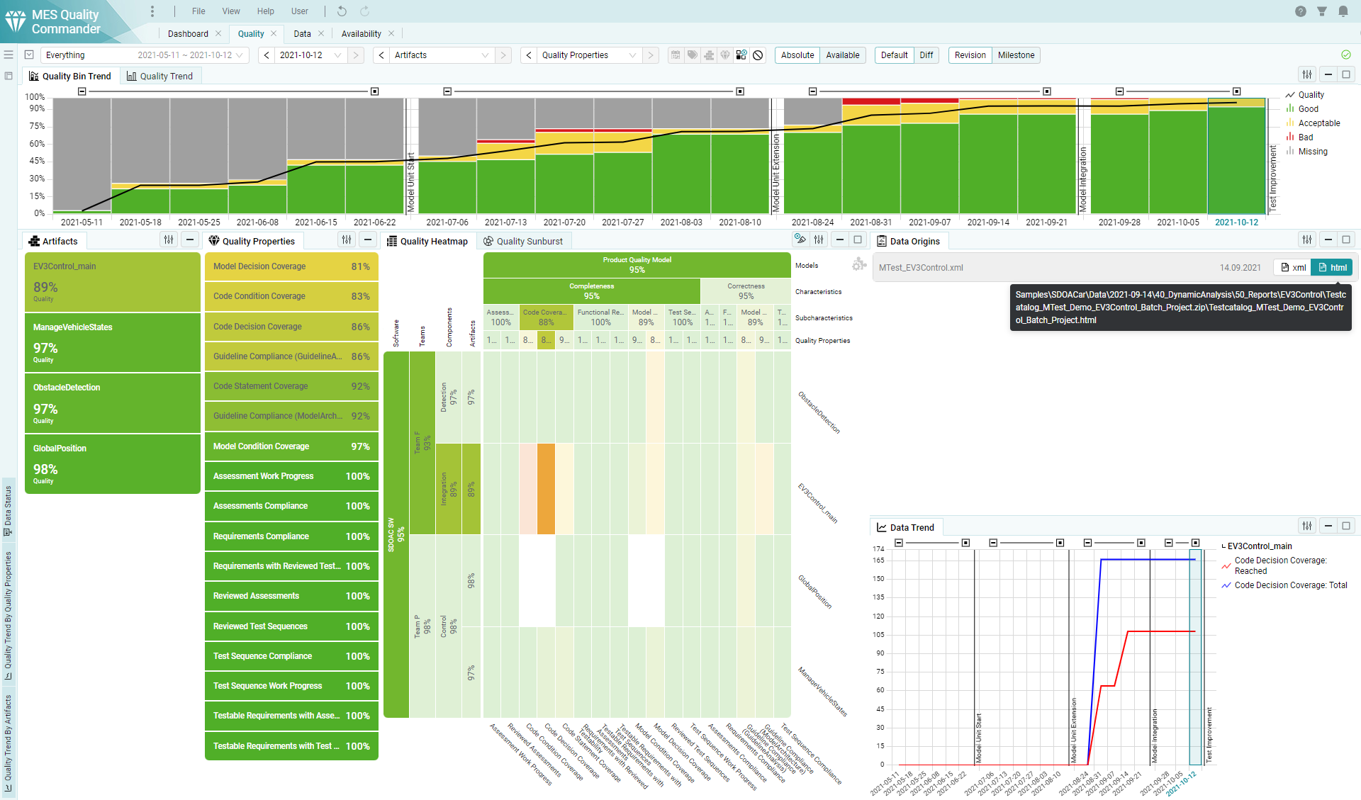
Figure 3.9 Data reports can be directly opened via MQC.
Whenever available, MQC offers a human readable report file next to the report the data was read from (e.g. in xml format) like for instance an HTML report, which is opened then in a browser.