3.4. Visualizations
3.4.1. Trend
The Trend visualizations show all visible revisions in a time based bar / line chart (see Date Range Selection).
Visible milestones are shown as vertical lines (see Milestone Visibility Selection).
Grouping of revisions is by default set to months. This can be changed with the “Date Groups” display option to Weeks, Months, Quarters or Years. The groups are visible on top of the revisions and can be collapsed [-], expanded [+] and focused on [ ].
Visualization options allow the override of the View selection (normal / diff).
The selected revision for the status visualization is highlighted with the border and name colored blue.
Marking of one or multiple revisions is possible by clicking in the chart area of the visualization.
3.4.1.1. Bin Trend
The Bin Trend visualization shows stacked bins of Quality, Availability or Data Details. Additionally a line shows the total Quality or Availability.
The legend allows the marking of one or more bins.
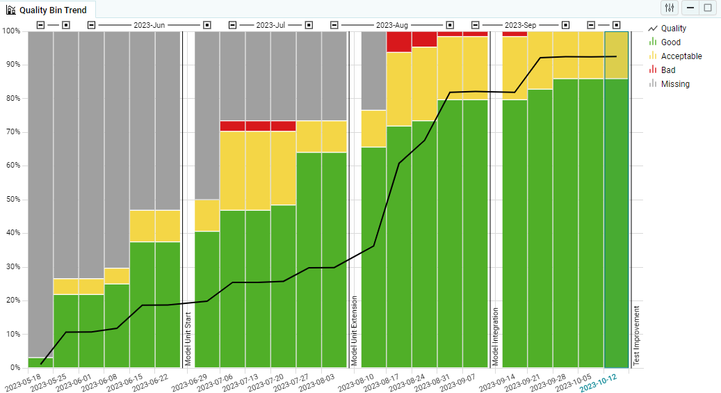
Figure 3.17 Quality Bin Trend on the Quality page as main visualization
The following visualization options allow customizing the bin trend:
View (Default / Diff)
Changes the view for this visualization (see View (Default / Diff)).
Date Groups
Changes the date ranges the revisions can be collapsed [-], expanded [+] and focused on [ ].
3.4.1.2. Quality / Availability Trend
This trend visualization shows the total quality or availability as bars.
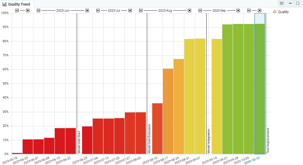
Figure 3.18 Quality Trend on the Quality page as main visualization
The following visualization options allow customizing the quality/availability trend:
View (Default / Diff)
Changes the view for this visualization (see View (Default / Diff)).
Date Groups
Changes the date ranges the revisions can be collapsed [-], expanded [+] and focused on [ ].
3.4.1.3. Quality Trend by Artifacts
This trend visualization shows lines for each artifact that shows their quality.
The legend allows the marking of one or more artifacts.
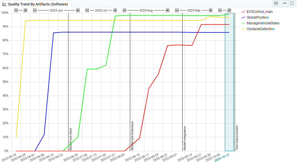
Figure 3.19 Quality Trend by Artifacts on the Quality page as main visualization
The following visualization options allow customizing the bin trend:
Artifact Structure
Changes the artifact structure level that is used here (see Structure Selections).
View (Default / Diff)
Changes the view for this visualization (see View (Default / Diff)).
Date Groups
Changes the date ranges the revisions can be collapsed [-], expanded [+] and focused on [ ].
3.4.1.4. Quality Trend By Quality Properties
This trend visualization shows lines for each quality property that shows their quality.
The legend allows the marking of one or more quality properties.
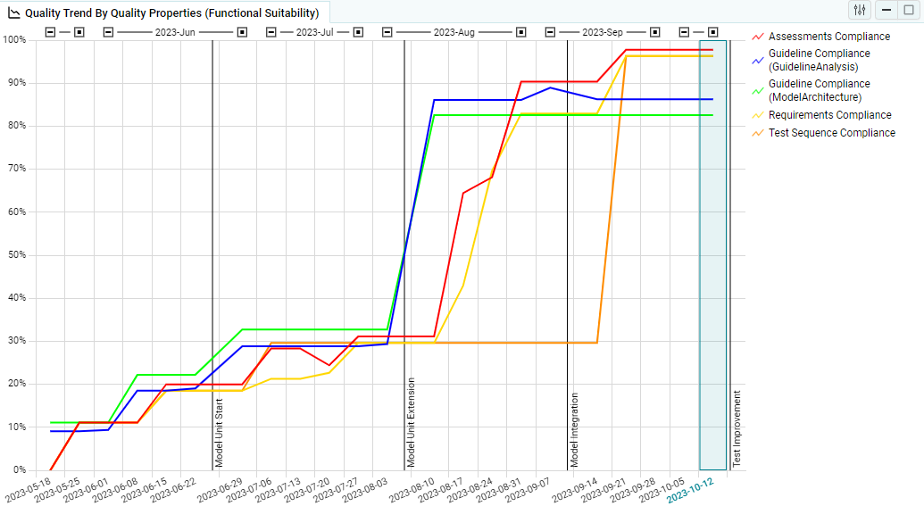
Figure 3.20 Quality Trend By Quality Properties on the Quality page as main visualization
The following visualization options allow customizing the bin trend:
Quality Structure
Changes the quality property structure level that is used here (see Structure Selections).
View (Diff Mode)
Changes the view for this visualization (see View (Default / Diff)).
Date Groups
Changes the date ranges the revisions can be collapsed [-], expanded [+] and focused on [ ].
3.4.1.5. Data Trend
The data trend visualization shows lines for every measure variable for each artifact for one measure. The lines are colored in adjacent colors for each artifact.
You can highlight specific measures by selecting them in the legend, or you can reduce their number to the ones of interest by selecting their corresponding elements in the KPIs.
The legend groups the measure variables by the visible artifacts and allows the marking of one or more artifact + measure variables.
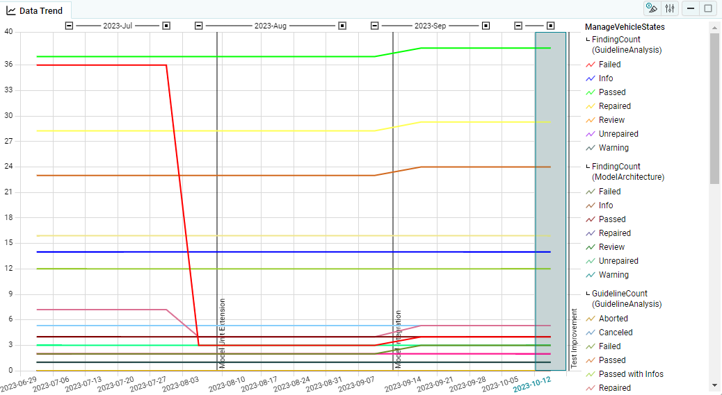
Figure 3.21 Data Trend on the Quality page as main visualization
The following visualization options allow customizing the bin trend:
Artifact Structure
Changes the artifact structure level that is used here (see Structure Selections).
Date Groups
Changes the date ranges the revisions can be collapsed [-], expanded [+] and focused on [ ].
3.4.2. Status
The Status visualizations show the Quality, Availability or Data Details of the selected revision (see Revision Selection).
Visualization options allow the override of the Artifact, Measure, Quality Property and/or Finding Structures and the View selection (normal / diff).
It is possible to mark elements in quality, data or data details by clicking in the chart area of the visualization.
3.4.2.1. Heatmap
The Heatmap shows the Quality or Availability with a Matrix of Artifacts x Quality Properties, Artifact x Measures or Artifact x Findings based on the Structure selections.
The selected Artifact Structure is shown with aggregated values on the left and the Quality Property Structure Measure Structure or Finding Structure is shown with aggregated values on the top.
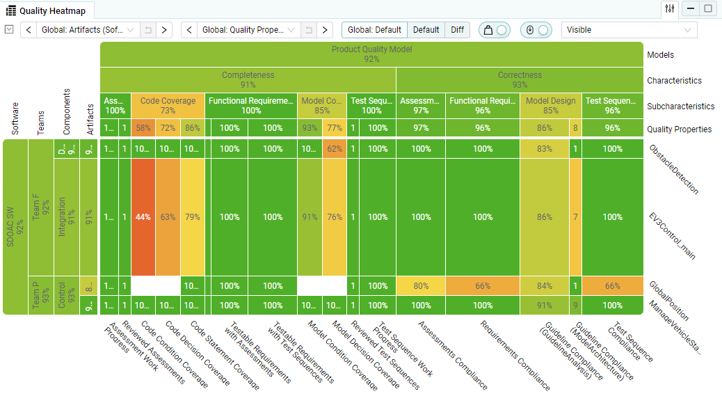
Figure 3.22 Quality Heatmap on the Quality page as main visualization
The following visualization options allow customizing the heatmap:
Artifact Structure
Changes the artifact structure level that is used here (see Structure Selections).
Quality Structure
Changes the quality property structure level that is used here(see Structure Selections).
View (Diff Mode)
Changes the view for this visualization (see View (Default / Diff)).
Weights
Indicates whether the columns and rows of the heatmap be sized according to the defined artifact and quality property weights.
(this option has no impact on the calculation of the quality aggregation, the weights are always used for the calculation)
Scrolling
Indicates whether the visualization have a minimum height for the rows and show a vertical scrollbar if there are too many artifacts to show at once.
Labels
Indicates which and whether the labels/values are displayed.
3.4.2.2. Sunburst
The sunburst shows a aggregated view on the quality property structure for quality and measure structure for availability.
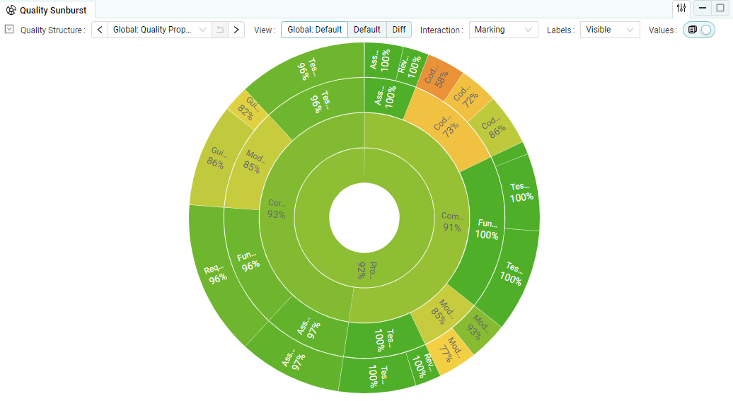
Figure 3.23 Quality Sunburst on the Quality page as main visualization
The following visualization options allow customizing the sunburst:
Quality Structure
Changes the quality property structure level that is used here (see Structure Selections).
View (Default / Diff)
Changes the view for this visualization (see View (Default / Diff)).
Interaction
Defines what will happen when clicking on an element in the chart area. By using Alt+Click the not selected option (Drill-Down or Marking) can be achieved without changing the interaction.
Labels
Indicates which and whether the labels/values are displayed.
Values
Indicates whether the values are displayed. (avaible for Quality or Availability)
3.4.2.3. Data Details Treemap
The Data Details Treemap shows the findings in a structured way. This can be, for example, their artifact substructure (default), which is usually the structure of the underlying software to which they refer.
The color of the structure elements and levels corresponds to the color of the result with the worst impact on the overall result. A tooltip shows more detailed information about the numbers and result types of the related findings.
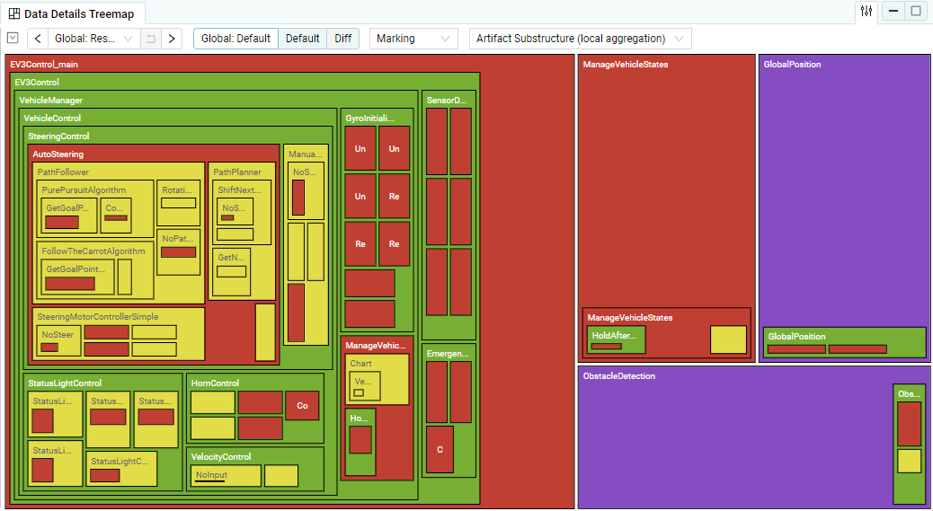
Figure 3.24 Data Details Treemap
The following visualization options allow customizing the data details treemap:
Finding Bin Structure
Changes the finding bin structure that is used for the result types in this visualization (see Finding Bin Structure).
View (Diff Mode)
Changes the view for this visualization (see View (Default / Diff)).
Interaction
What should happen when clicking on an element in the chart area. By using Alt+Click the not selected option (Drill-Down or Marking) can be achieved without changing the interaction.
Structure
Indicates whether the Treemap shows the findings structured by the artifact sub structure or by the full finding structure.
If “Artifact Substructure” is selected, the worst result will not aggregate to higher structure levels. If “Finding Structure” is selected, the worst result will aggregate to higher structure levels.
3.4.2.4. Data Details List
The Data Details List shows the imported findings in a table.
You can sort the list by clicking on the column headers. The previous selection is always used as the secondary sorting direction, which makes it possible to sort by two columns.
By pressing the ‘+’ button on a row you can view further details of the finding. If a human readable report file is available, a button is shown that opens the file. An html report scrolls to the position of the finding, if possible.
To ensure good performance, the number of findings displayed in the Data Details List is limited in large projects. By using grouping (see option below) or marking in other visualizations (see Marking) only the relevant findings will be shown.
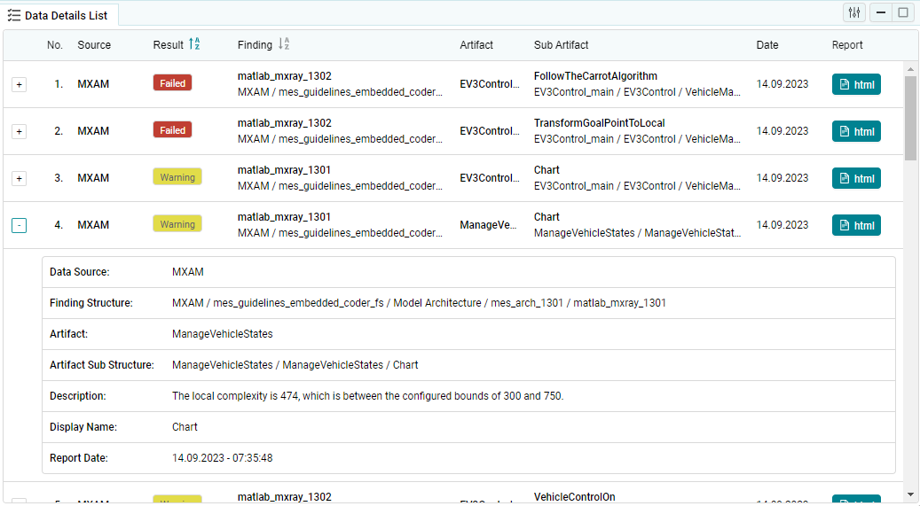
Figure 3.25 Data Details List with expanded details
The following visualization options allow customizing the data details list:
Finding Bin Structure
Changes the finding bin structure that is used for the result types in this visualization (see Finding Bin Structure).
View (Default / Diff)
Changes the view for this visualization (see View (Default / Diff)).
Group By
Indicates whether the findings should be grouped by a specific criteria (e.g. by artifact).
3.4.2.5. Data Status
The Data Status shows the measure values as a bar chart for the selected measure.
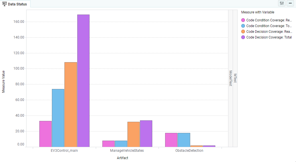
Figure 3.26 Data Status on the Quality page as main visualization
The following visualization options allow customizing the data status:
Artifact Structure
Changes the artifact structure level that is used here (see Structure Selections).
3.4.2.6. Data Origins
The Data Origins show the imported data source files with human readable files, if present. By clicking on the report file you can open and view the corresponding file directly from MQC.
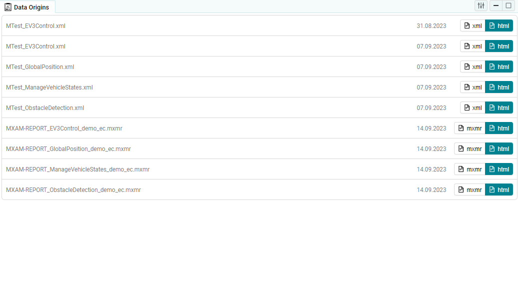
Figure 3.27 Data Origins on the Quality page as main visualization
3.4.3. KPI
The Key Property Indicator visualizations show the Artifact Structure, Quality Property Structure, Measure Structure or Finding Structure for the selected revision. The Quality or Availability values are aggregated. In the Data Details page the KPI-elements show the worst result and the number of findings per result.
When a level of the structure is selected the visualization allows the expanding and collapsing of the sub-levels by clicking on the [+] or [-] buttons.
Marking of one or multiple Artifacts, Quality Properties or Measures is possible by clicking on them in the chart area of the visualization.

Figure 3.28 KPI visualizations of Artifacts and Quality Properties on the Quality page
Visualization options allow the override of the Artifact, Measure, Quality Property or Finding Structures and the View selection (normal / diff).
The following visualization options allow customizing the kpi:
Structure Level
Changes the structure levels that are used here (see Structure Selections)
View (Diff Mode)
Changes the view for this visualization (see View (Default / Diff)).
Search
Filter the visible elements by searching.
Sorting
In which order the elements should be shown.