3.3. Interactive Pages
The interactive pages of MQC are separated into 4 different types, that share the same functionality but differ in the information they present and how it is shown.
Quality Page
The quality page shows the quality of your project that is calculated by definition of the quality model out of your data.
It is also possible to view the data related to that quality.
(see Data from Quality)
Data Page
The data page shows the Data of your project in the way it was imported by the data source adapters.
It is also possible to view the data origins and open the relevant report files directly in MQC.
(see Data Origins)
Availability Page
The availability page shows the availability of the data in your project and also highlights propagated data.
It is easy to see the still missing data, that is not excluded as “not expected” by context categories.
(see Context Categories)
Data Details Page
The data details page shows detailed information about the data in your project.
3.3.1. Overview
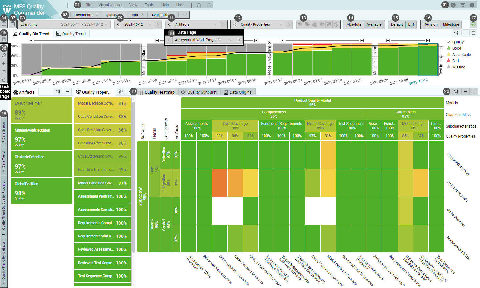
Figure 3.10 Quality page with important features annotated
Menu
(see Menu)
UserGuide, Filter panel, Notifications
UserGuide - Link to the user guide.
Filter panel - Show or hide the filter panel.
Notifications - Open the notification menu where warnings and errors are listed. New notifications pop up as messages temporarily before they disappear. Until the notifications are discarded, they remain in the notification list in the menu. Notifications should be considered with care and only ignored or discarded when the problems behind them are understood.
Page Navigation
All enabled pages for your project are shown in the page navigation and can be opened by clicking on them. It contains dashboard, interactive, and custom pages. Only an Editor user can remove and/or add pages.
Configuration Menu (only for Editors)
(see Managing Configurations)
Page Layout Switcher
The Page Layout Switcher allows you to select a different predefined page layout from template.
(see Templates)
Dashboard Controls (only on Dashboard Page)
(see Dashboards)
Toolbar Menu
The toolbar menu contains all toolbar items for the current page, so in case some toolbar items are not visible because the screen width is not enough to render all the items, they are still accessible in this menu.
(see Toolbar)
Date Range Selection
(see Date Range Selection)
Revision Selection / Milestone Selection
(see Revision Selection)
Milestone Visibility Selection
Artifact Structure Selection
(see Structure Selections)
Quality Property Structure Selection (only on Quality Page)
Measure Structure Selection (only on Data Page)
Finding Structure Selection (only on Data Details Page)
(see Structure Selections)
Active Markings
(see Active Markings)
Quality Assessment Scope (only on Quality Page)
(see Quality Assessment Scope)
View (Default / Diff) (not on Data Page)
(see View (Default / Diff))
Data Import State
(see Data Import State)
Minimized Visualizations
Minimized visualizations are collected on the left side of the page. They can be restored to the page by clicking on their tab or by dragging them into the page areas.
(see Visualizations)
Visualization Tabs (Visible and Invisible Visualizations)
Multiple visualizations can be placed together in a group. Only one visualization in a group is active, while the rest of the visualizations are inactive. By clicking on a tab, the clicked on visualization becomes active.
(see Visualizations)
Visualization Controls (Options, Minimize, Maximize)
Visualization options are different for each visualization and allow specific settings for the visualization and/or the overriding of global toolbar options.
MQC allows you to maximize and minimize visualizations. When maximized, a visualization fills all page layout areas. However, the page layout is not modified and can be restored by clicking the restore (unmaximize) button.
(see Visualizations)
3.3.3. Page Layout
The page is divided into 3 different areas: Top, Kpi and Main.
While the Top and Kpi area of the page collapses when all visualizations inside these areas are minimized, the Main area expands into the space a collapsed area leaves behind.
The Kpi Area is reserved only for Kpi visualizations and Kpi visualizations can only be placed into the Kpi area.
The Top and Main Area support all non-Kpi Visualizations.
Visualizations can be placed side by side or stacked to each other in any complex nesting.
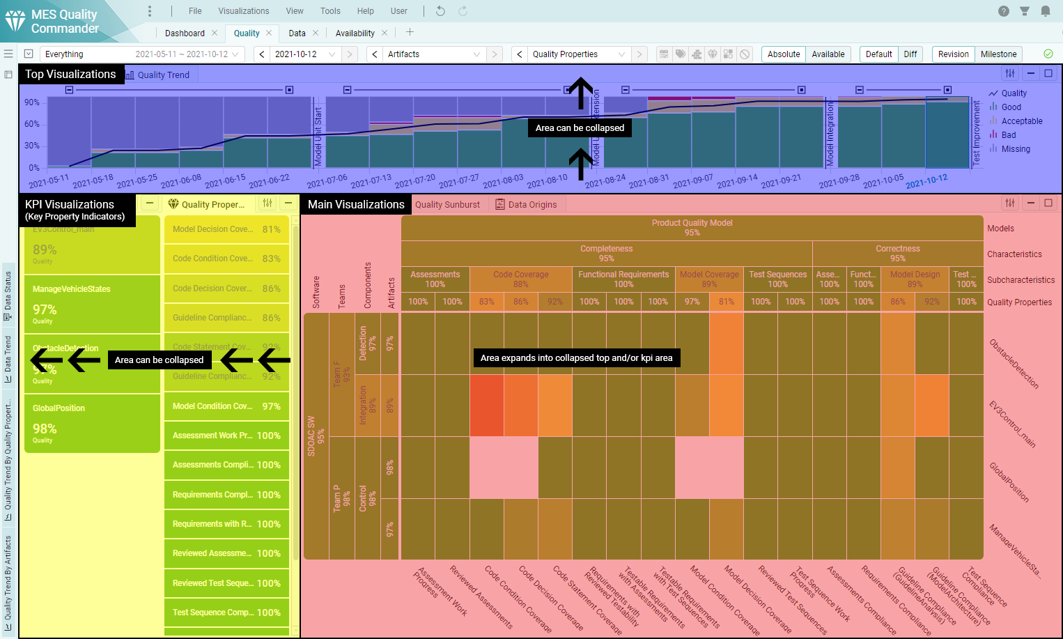
Figure 3.11 Quality page with the 3 page layout areas highlighted
3.3.3.1. Visualizations
Visualizations can be:
Active
The visualization is visible and the tab of the visualization is in the active state.
Inactive
The visualization is part of a visualization group and is currently not the active tab.
Minimized
The visualization is removed from the page and minimized to the left of the page as a vertical tab.
Maximized
The visualization (and it’s group with inactive visualizations) take up the whole space of the page. The page layout is not modified and the visualization can be restored to its initial state.
3.3.3.2. Drag & Drop
The page layout can be modified through drag & drop.
Active, inactive and minimized visualizations can be dragged from their current position and dropped at valid drop locations.
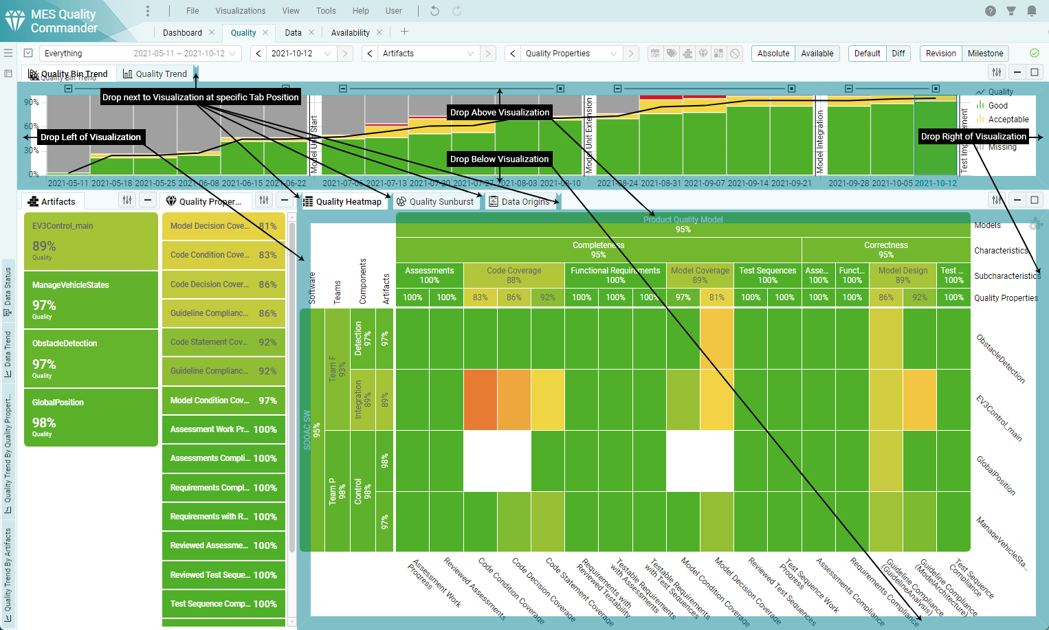
Figure 3.12 Quality page while dragging a visualization tab
Valid drop locations are:
Left or Right of a Visualization
By placing a visualization left or right of another visualization, it is placed side by side to it. Each visualization in a side by side takes up the same width. (e.g. 2 visualizations side by side means 50% of the width for each. 3 visualizations would mean a width of 33.34% for each)
Above or Below a Visualization
By placing a visualization above or below of another visualization, they are placed in a vertical stack. Each visualization in a vertical stack takes up the same height. (e.g. 2 visualizations side by side means 50% of the height for each. 3 visualizations would mean a height of 33.34% for each)
Next to a Visualization (Tab Position)
By placing a visualization next to another visualization it is put into a group with the visualizations already there. Only one visualization of a group can be active, the other visualizations in that group are inactive until their tab is clicked on.
3.3.3.3. Templates
The Editor can supply page layout templates that provide predefined page layouts (see Pages Layouts). A predefined layout can be applied by selecting it in the Page Layout Switcher.
MQC ships with 4 page layout templates for the quality page for the most common use cases:
Status: Quality status of one revision
(with Kpis for marking)
Trend: Quality trend over a date range
(with Kpis for marking)
Status with Data: Quality status of one revision with related data status
(Marking in Heatmap or Sunburst allows viewing of related data)
Trend with Data: Quality trend over a date range with related data trend
(Marking in trends allows viewing of related data)
Data Details: Quality status of one revision with related data details
3.3.4. Toolbar
Every page includes a toolbar on top. Depending on the page type, the toolbar contains different elements and displays relevant options for the current page. It shows, for instance, the selections of date range, revision, structures, and view mode that are applied and active. In addition, it allows quick access and fast modifications to these options.
3.3.4.1. Date Range Selection
Selecting a date range filters all visualizations and the Revision Selection. If the marked or selected revision is not part of the new date range, the latest revision in that time frame is selected automatically.
The date range selections provides different forms of selections:
Everything (Default)
All revisions of the project are shown.
This is the best selection for short projects, to get a full overview of your project.
Weeks or Months or Years
Select one or multiple weeks, months or years.
After selecting this form of selection, a week, month or year can be chosen in a date picker.
If more than one date is needed, additional dates can be added with the [+] button (e.g. 2 weeks for a fortnight).
The arrow buttons move the date range in one interval: week, month or year.
Manual
The manual selection allows for a date range based on a specific start and end date. These dates can be chosen with a range date picker.
The arrow buttons move the date range in the duration chosen (e.g. if a start to end range of 3 months is chosen, the arrows switch to a date range of the next/previous 3 months.)
3.3.4.2. Revision Selection
One revision is always selected as the active revision for the status visualizations. Trend visualizations show a highlighting of this revision. By default the latest available revision is selected. By marking one or more revisions in a trend visualization, the options in this selection are reduced. Selecting an revision changes the information, that is show in the status visualizations. The revision selection can be overridden in visualization options of status visualizations.
3.3.4.3. Milestone Visibility Selection
Multiple milestones or milestone sets can be selected as the visible milestones. Trend visualizations show the milestones with vertical lines and a tooltip. By default all milestones are selected.
If there is a tree structure of milestone sets defined (see Milestone Structures), the milestone sets can be expanded and collapsed in the selection dropdown by clicking on the arrow left of the checkbox.
By clicking on the checkboxes multiple milestones and/or milestone sets can be selected or deselected.
By clicking on the name of the milestone and/or milestone set only the milestone / milestone set is selected and other selections are deselected.
The milestones selection allows to search and filter the milestones / milestone sets in the dropdown by typing in the selection box.
3.3.4.4. Structure Selections
Structure selections show the configured structures of the quality model, the project, the measures, and the findings. The structure levels are shown in a tree dropdown, while the real structures are only visible in the visualizations (Heatmaps, Sunburst, Treemaps, Lists and KPIs). When selecting a level in a structure, all elements that are not assigned to this structure are filtered out. By selecting different levels of a structure the visualizations aggregate the quality or availability in a way that respects the weights of the structures and its elements.
The structure selections can be overridden in visualizations that use the related structures.
3.3.4.5. Finding Bin Structure
This option is only available in the data details page or for data details visualizations. With configuration of the finding bin structure different finding results (from the same or different data sources) can be renamed, sorted and grouped together, to treat similiar results the same way. Switching the active finding bin structure is possible with a click, or by using the drop down menu. The option None (original) shows all findings with their original result type.
3.3.4.6. Finding Bin Visibility
This option is only available in the data details page. You can use the finding bin visibility to filter the finding results in the KPIs, Heatmap and Treemap. In the List the findings itself are filtered by this selection. Switching the active finding bin visibility is possible with a click, or using the drop down menu.
3.3.4.7. Active Markings
There are different types of markings that act as filterings for other visualizations. (see Marking)
The toolbar item shows 5 categories of markings and informs if there is currently a marking in those marking categories:
Revisions
Marking in the trend visualizations, used as filtering for Quality Properties or measure Kpi, artifact Kpi, trend and status visualizations.
Bins
Marking in the bin trend visualization (legend), used as filtering for quality properties or measure Kpi, artifact Kpi, trend and status visualizations.
Artifacts
Marking in the artifacts Kpi visualization, used as filtering for quality properties or measure Kpi, trend and status visualizations.
Quality Properties
Marking in the quality properties Kpi visualization, used as filtering for artifacts Kpi, trend and status visualizations.
Findings
Marking in the finding Kpi visualization, used as filtering for artifacts Kpi, trend and status visualizations.
Main
Markings in the status or trend visualizations, used as a filtering for the data / data details visualizations on the quality page.
The Marking toolbar item also allows the resetting of marking categories or all active markings by clicking the reset buttons.
3.3.4.8. Quality Assessment Scope
There a up to 3 different Quality Assessment Scopes:
Absolute
Shows the absolute quality.
Available
Shows the same as Absolute, but the missing quality is ignored.
Relative (only available if target values have been configured)
Shows the relative quality related to target values. (e.g. if the quality for a specific artifact for a specific revision is 80% and the related target values is 80% the relative quality is 100%.)
3.3.4.9. View (Default / Diff)
Switching the view is possible with a click. The Default view shows the quality or availability of the project, while the Diff view shows the differences between Revisions or Revisions to the last milestone as Increase or Decrease in percentage points.
3.3.4.10. Data Import State
This icon shows the current state of the imported data.
If the data is up to date, a green check mark is shown. If the monitoring detects a change in the data source a refresh button allows the manual update of the data.
3.3.5. Marking
By marking you can select one or more elements in visualizations. Elements can be a tile in Kpi, heatmap and sunburst visualizations, a legend item in trend visualizations or a bar in trend and status visualizations. The marked elements are highlighted and a button on the top right of a visualization is enabled, with which the marking can be reset. Keep the Ctrl or Shift button pressed during clicking on an element adds this element to the existing marking, so that you can mark multiple elements.
The purpose of marking elements in a visualization is to filter or highlight related data in other visualizations.
3.3.5.1. Data Origins
The data origins visualization is available on the quality and data page and shows a list of the imported data reports.
The list of reports in the visualization can be reduced by filtering (see Filter Panel) and marking on the quality and data pages. Only the reports from one revisions are visible in the visualization at once. By marking a revision in the trend visualization or using the revision dropdown, the reports of another revision can be viewed. Reports that have been propagated from older Revisions are shown with grey text color.
This visualization shows the origin of the quality or data of the page and can be used to find and directly open the reports of data source for a specific artifact and revision. If additional human readable report files (e.g. html) were detected, they can also be accessed directly inside MQC.
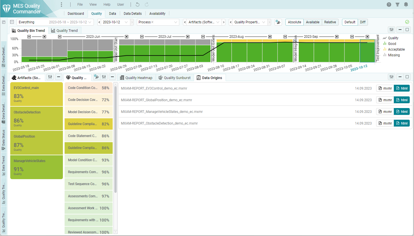
Figure 3.13 Data Origins visualization in the Quality page with reports from MXAM.
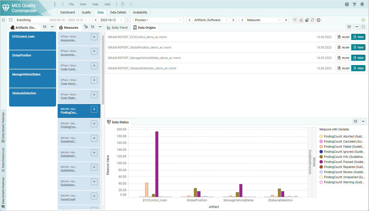
Figure 3.14 Data Origins visualization in the Data page with reports from MXAM.
3.3.5.2. Data from Quality
The data trend and data status visualization are available in the quality page and make it possible to easily get an overview of the underlying data, that was used to calculate marked quality values.
All markings on quality visualizations like artifacts, quality properties, quality bins and revisions, reduce the shown data in these data visualizations by marking.
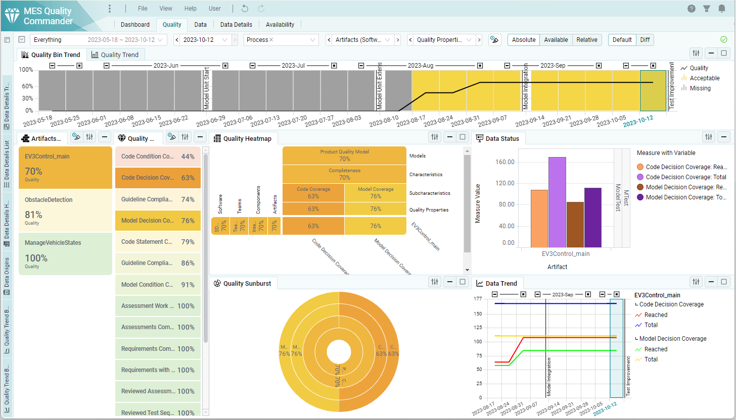
Figure 3.15 Data status and trend visualizations in the quality page to view the underlying data of quality by marking elements in quality visualizations.
As you can see in this picture, with the flexibility to change the layout of the page and marking the intended items, MQC gives you a clear picture of the transformation from data to quality.
3.3.5.3. Data Details from Quality
The data details trend and status visualizations are available in the quality page. These visualizations give an in depth view on the findings making up the data, that was used to calculate quality.
All markings on quality visualizations like artifacts, quality properties, quality bins and revisions, reduce the shown findings in the data details visualizations by marking.
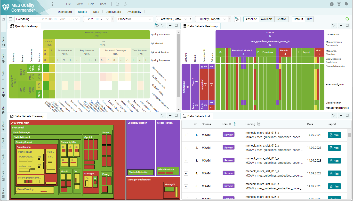
Figure 3.16 Data Details List and Treemap visualizations showing underlying data findings of the marked elements in the quality visualizations.
3.3.5.4. Data Details from Data
The data details trend and status visualizations are available in the data page as well. Here you can see the details of the data that was marked in the KPI or Data Trend visualizations.
3.3.6. Display Options
Options that only affect how MQC is displaying information can be changed by any user.
These display options are:
Toolbar Selections (see Toolbar)
Markings (see Marking)
Active Page
Active Page Layouts for Quality, Data and Availability pages (see Page Layout)
Visualization Options (see Visualizations)
The display options can be restored to the ones the editor saved for the project by using the menu item “View > Restore all display options”.
3.3.6.1. User Preferences
MQC saves the display options per user and per project on the server automatically.
When reopening a project from the library the display options you have chosen previously are applied in the background and the project will have the same state of display options as before.