3.5. Diff View
Use the Diff View to see how the state of your project has changed since the last revision.
Advantages of the Diff View are:
to focus only on the elements that have changed instead of your entire project
to identify causes of negative developments more quickly
to check whether the project is progressing steadily
The Diff View can be enabled via the option in the toolbar for all visualizations of the project at once in which this mode is supported (see View (Default / Diff)) or in a specific visualization in order to activate the view locally in this visualization only (see Visualizations).
Depending on the page and visualization, the Diff View can give you different kinds of information. The changes are shown as increases and decreases for availability or improvements and deteriorations for quality. On the Data Details page the changes are shown as new and gone in the trend and list, while the kpis, heatmap and treemap show major improvements, improvements, minor improvements, major deteriorations, deteriorationsand minor deteriorations. ```
3.5.1. Quality Diff
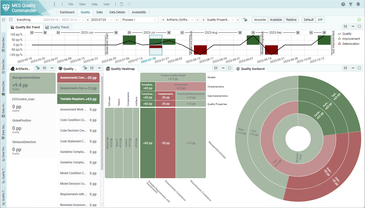
Figure 3.29 Quality Page in Diff View
3.5.1.1. KPIs and Status Visualizations
The KPIs and status visualizations like the Heatmap and Sunburst have the same behavior as in the Default view. But instead of showing the quality in %, they show the changes of quality in percentage points (pp). Improvements are represented by a green color and deterioration by a red color. The color intensity shows the magnitude of the change.
3.5.1.2. Trend Visualizations
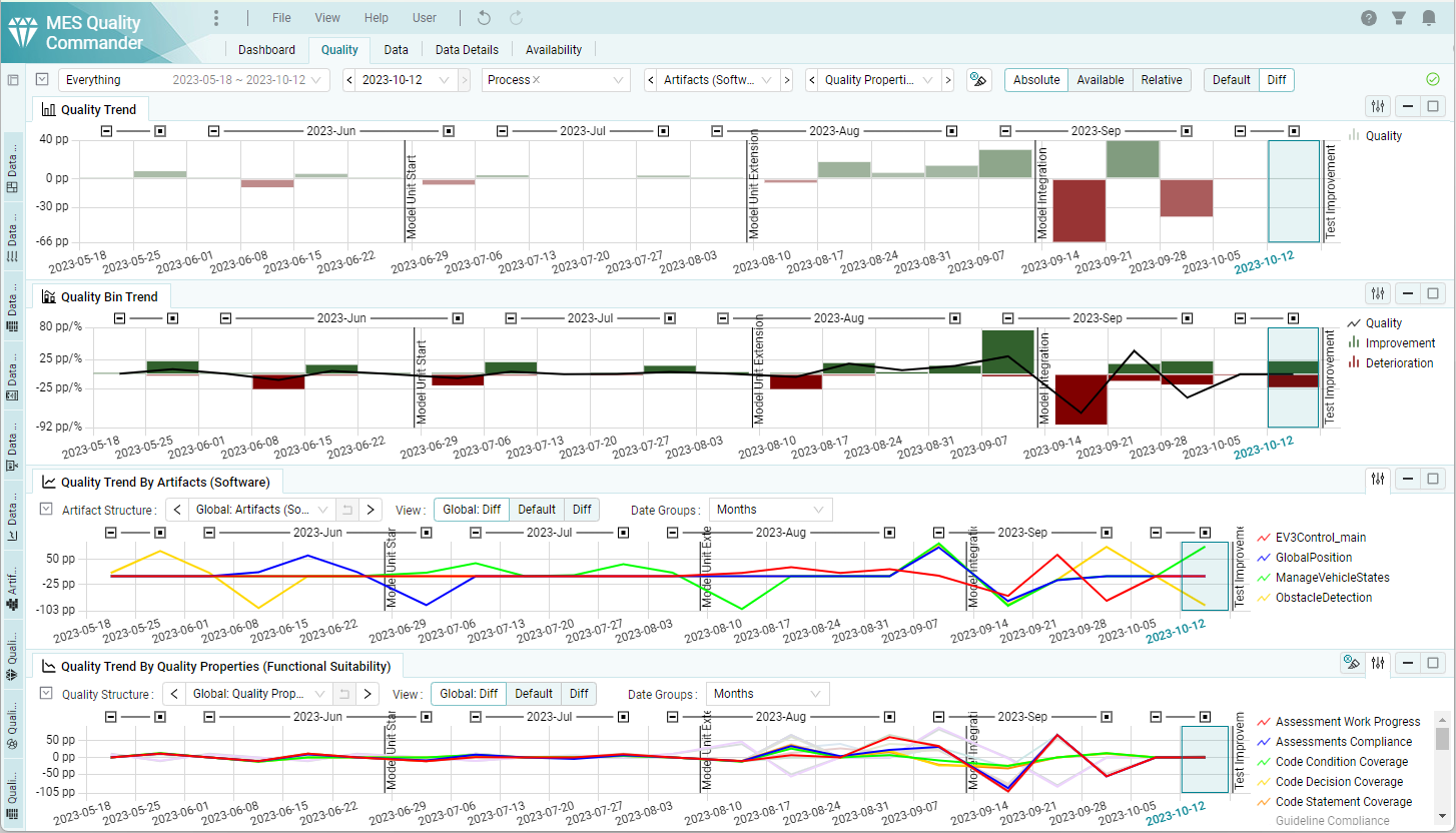
Figure 3.30 Different Quality Trend visualizations in Diff View
Quality Trend
In Diff View the Quality Trend shows the increase (green) and decrease (red) of the absolute quality in percentage points (pp, see Wikipedia) since the last revision or milestone.
Quality Bin Trend
The Quality Bin Trend shows how many quality points (per Revision x Artifact x Quality Property) have a improvement or deterioration in percent. The percentages with an improvement are shown in green and as positive and those with a deterioration are shown in red and as negative value.
Additionally the changes in the total quality is shown as percentage points with a black line.
Quality Trend By Artifacts
The Quality Trend By Artifacts visualization shows the increase and decrease of the quality of each element of the selected artifact structure level as lines.
Quality Trend By Quality Properties
The Quality Trend By Artifacts visualization shows the increase and decrease of the quality of each element of the selected quality property structure level as lines.
3.5.2. Data Details Diff
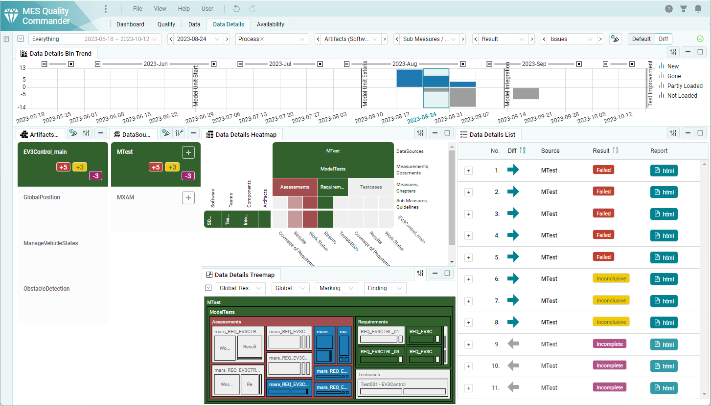
Figure 3.31 Data Details Page in Diff View
Data Details Bin Trend
In Diff View the Data Details Bin Trend shows the changes in the number of findings. New findings are shown in blue and as positive and gone findings are shown in grey and as negative.
KPIs
In the KPIs the changes are shown aggregated for the related structure element. The color of the KPI element and its intensity represents the general improvement (green) or deterioration (red). The number of finding changes are listed by the colors of their results, that are new (+) or gone (-).
Data Details Heatmap / Treemap
The Data Details Heatmap and Treemap show improvements (green) and deteriorations (red), as well as new (blue) and gone (grey) available data. Improvements and deteriorations are further broken into major (the worst result changed), normal (the number of finding results of the worst result changed) and minor (the number of finding results of not the worst result changed).
Data Details List The Data Details List contains a “Diff” column while the Diff view is active. The new column shows if a finding is New (blue right arrow) or Gone (grey left arrow). Unchanged findings are not shown at all.
3.5.3. Availability Diff
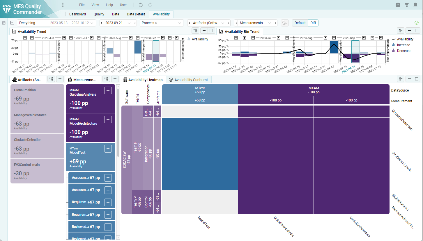
Figure 3.32 Availability Page in Diff View (Example project without propagation enabled)
The increase in available data is shown in blue and the decrease is shown in purple. In all other aspects, the behavior of the visualizations on the Availability Page is the same as on the Quality Page.