10. Pages and Visualizations in Detail
In this chapter, we will take you through the steps involved in performing a detailed quality evaluation in MQC. This will give you a good impression of the functional details of MQC. At the same time, it helps you get accustomed to the tool in a more detailed way than in Quick Start Guide where a quick introduction to the basic functionality of MQC is given.
Building on this and taking into account the pages for a project, conclusions about the development of software projects are described. Based on these conclusions MQC shows possible reasons for bad quality and helps you deducing actions to carry out for improving quality.
10.1. The MQC Pages Concept
MQC structures all the important information of your project and shows it on different pages. Mainly, there are two kinds of pages, showing either data or quality, containing trend and status visualizations respectively, i.e. Quality Trend and Quality Status, as well as Data Trend and Data Status.
The Quality Trend page will give an overview of the quality of your project, whereas the Quality Status, Quality Sunburst and Quality Heatmap page provides an in-depth analysis of Artifacts, i.e. an overview of the quality of each Artifact.
The Data Status page will give you an overview of the data of your project. By means of Data Details functionality (Data Details) you can easily navigate from quality pages, such as Quality Status or Quality Sunburst, to the data pages to track the source of a measurement. In other words, going one level down at the data source level to Data Trend where you can see your raw data’s trend and get an overview of your related base measures.
On all status pages the main visualization always shows one revision with the possibility to scroll between all (or the currently selected) revisions. By default, all revisions means all revisions with imported data. For example, if revision granularity is set to Days, but not every day something is imported, days without imported data are not shown in the visualizations.
The headlines of the status main visualizations then contain the name of the currently shown revision, except for the case that a revision is the last one (with imported data) before a certain project milestone is reached (see Project Milestone Structure). In that case the headline also shows the milestone name.
The general concept of all pages is that all the visualizations are interactive: If you click into any of the visualizations, the other visualizations will react and then show information related to what you have marked. You can do the major selections on the left and top sections of the visualization window and the effect can be seen in the main/bottom right visualization.
Marking is cumulative. The marked elements of the first chart will not reset if you mark something in the next chart later. The effect is a combination of marking done in both the charts. To go back to normal state click on the chart where there are no elements.
Based on the Project Structure you have imported, the right side panel will display options for filtering the data.
All MQC pages can be easily added or removed using the dialog of the left-hand side panel (see Manage Pages).
In the following subsections the main pages are described in detail.
10.2. Dashboard
The Dashboard page gives a first overview on the current status of the most important aspects of the project at a glance. It can be used as starting point for quality evaluation and to explore the details of quality deficits in your products. MQC provides a default dashboard page as explained below which can also be customized as per your requirements (see Dashboard Customization).
Each visualization in the default dashboard shows a particular aspect of quality assessment in a compressed way, thereby leaving out any details that instead can be found in the main visualizations of the MQC standard pages. For that purpose, MQC provides a link to the corresponding detail page in the top-right corner of each visualization.
If not visible, the Dashboard page may be added using the dialog of the configuration panel (see Manage Pages).
Marking does not apply to the Dashboard page. But instead, filtering the data via the filter panel at the right-hand side may be used to concentrate on specific aspects.
The Default Dashboard page consists of the following visualizations:
Project Information (top-left):
The Project Information provides some general information regarding the project. Here you will find the number of days left until the end of the project, until the next milestone as well as the current revision.
In addition to values depicting the current overall quality and availability, the number of artifacts is shown as well as the number of data points, which means the size of the data loaded into MQC and used for quality calculation.
Quality Trend (top-right):
The Quality Trend diagram shows 3 aspects of the overall quality of the project and how it evolves over time. Vertical lines display the project milestones.
Absolute Quality: This overall project quality is calculated using all data also including missing data.
Available Quality: This overall project quality is calculated using the available data only, excluding the missing data. This directly shows the quality of the things already done.
Relative Quality: The third quality trend line shows the overall project quality in relation to targets configured for particular milestones (see Target Values). An absolute current quality of only 50 % is quite bad, but if the plan was to achieve 50 % at that point in time, it is excellent (100%).
If no specific targets were imported, Absolute Quality and Relative Quality are showing the same trend lines.
Actions (middle-left):
The Actions visualization shows the actual tasks to improve the current quality. This is based on most recently loaded data. It provides a sorted list of actions per artifact as well as a distribution of actions according to priority groups.
For details on actions see Actions.
Quality Status (midst):
The Quality Status shows the 4 artifacts with worst quality as well as the quality distribution according to the defined quality bins in general. As per default this means how many quality measure values are
good (over 80 % quality)
acceptable (20 % - 80 % quality)
bad (under 20 % quality)
missing (i.e. quality could not be calculated because of missing data).
Data Availability (middle-right):
The Data Availability shows the 4 artifacts with worst availability status as well as the availability distribution in general, means how much data currently has been loaded into MQC, how much has been propagated from previous revisions, and what is the proportion of still missing data.
Quality Breakdown (bottom-left):
The Quality Breakdown visualization shows a condensed Sunburst chart (see Quality Sunburst) just containing the overall quality (centre) and the quality characteristics (outer ring) as defined in the quality model (see Quality Model Structure).
By this, you are able to see the project quality for specific aspects like “Correctness”, “Completeness” or “Consistency” at a glance. You may also define different characteristics within your quality model to focus on other facts, e.g. “Functionality” or “Test Progress”. For more information see Quality Model Configuration.
Quality Diff By Artifact (bottom-midst):
This chart provides a short overview on how quality has been changed since the previous revision. Per artifact it is shown if quality has been increased or decreased.
Availability Diff By Artifact (bottom-right):
This chart provides a short overview on how availability has been changed since the previous revision. Per artifact it is shown if availability has been increased or decreased.
10.3. Data pages
10.3.1. Data Trend
By means of the Data Trend page, you can track the source of a measurement, going one level down compared to the Data Status page, i.e. on data source level. You can see your raw data’s progression and processing getting an overview of your derived and related base measures.
It consists of the following selecting windows:
Projects (on the top left): Select your project as defined in your project structure. Notice, that you see an availability trend inside the tile. A gradient availability coloring is used that depends on the availability of all measure values for all artifacts shown for the currently selected revision.
Artifacts (Bottom left): Select the artifacts of your choice. By default, all are selected. A gradient availability coloring is used that depends on the availability of the measure values for a single artifact for the currently selected revision.
Measures (next to Artifacts): The count of the measures is with respect to all artifacts and for the currently selected revision. It uses a gradient availability coloring.
Availability Distribution: This is a bar chart, which bins the amount of available, missing and propagated data for each revision. A categorical availability coloring is used.
The Measure Trend visualization shows per Artifact for each measure value (base measures and derived measures) a trend over all revisions. If a certain revision is selected, the data value for this specific revision is shown only. It is possible to only show the trends for a single or for selected artifacts as well as for selected measures. The Measure Trend visualization uses a dedicated color per trend line for each measure value.
10.3.2. Data Status
The Data Status page offers the following selecting windows:
Projects (on the top left): Select your project as defined in your project structure. Notice, that you see an availability trend inside the tile. A gradient availability coloring is used that depends on the availability of all measure values for all artifacts shown for the currently selected revision.
Artifacts (Bottom left): Select the artifacts of your choice. By default, all are selected. A gradient availability coloring is used that depends on the availability of the measure values for a single artifact for the currently selected revision.
Data Sources (next to Artifacts): The availability of the measures per data source (and measurement, e.g. “TPT >> MiL” and “TPT >> SiL”) is with respect to all artifacts and for the currently selected revision. It uses a gradient availability coloring.
Availability Distribution: This is a bar chart, which bins the amount of available, propagated, and missing data for each revision. It uses a categorical availability coloring.
The Data Status chart is the reacting window to the selections (intersections) made by the marking in the selecting windows mentioned above. It also uses a categorical availability coloring.
Note
If data from one data source for multiple measurements was imported, marking one of the data source KPI tiles will select all “DataSource >> Measurement” tiles. A second click on a specific tile selects a particular data source and measurement.
10.4. Quality pages
10.4.1. Quality Status
The Quality Status page provides an in-depth analysis of the quality of Artifacts. Therefore, it will give an overview of the quality properties of each Artifact.
Selecting windows are:
Projects (on the top left): Select your project as defined in your project structure for which you want to see quality. If you have defined only a single project, it is selected by default. You can reset the marking for the entire page at any point by clicking on this tile. Notice, that you see a quality trend over all revisions inside the tile. A gradient quality coloring is used that depends on the overall quality for all artifacts, shown for the currently selected revision.
Artifacts (Bottom left): Select the Artifacts of your choice. By default, all are selected. The values within the tiles are always related to the currently selected revision. A gradient quality coloring is used that depends on the quality for each artifact, shown for the currently selected revision.
Quality Properties (next to Artifacts): Select the Quality Property. Note, that the Properties tiles are listed in ascending order of quality measure. If the quality measure cannot be computed, then it appears in the bottom of the list with an empty value. The values within the tiles are always of the currently selected revision. A gradient quality coloring is used.
Quality Bin Distribution (top): The computed quality property measures are binned according to the configured quality bins (see Quality Bin Configuration). The default quality bins used by MQC are Good, Acceptable and Bad. By marking the bins in this visualization you can do selections based on the computed quality status of all quality properties per revision. You can also select the revision of the data by selecting all the bins of the same revision. For example, if you select the green bin of the latest revision on the Quality Bin Distribution visualization, the reacting window shows an overview of all information related to good quality measures for this revision. For the bins a categorical quality coloring is used. Note, that the color definitions are also part of the quality bin configuration (Quality Bin Configuration).
The reacting window is a heatmap visualization plotted for each Artifact against each Quality Property. Each Quality Property tile has a gradient quality coloring, which represents the quality value for the particular property. Based on the marking from the selecting windows, the main visualiation is reduced to the selected items.
You can now start identifying the reason for bad quality. The general concept of identifying issues is to click on (or hover over) red quality bins or tiles. When clicking on red, data that corresponds to green and yellow bins is excluded from the chart visualizations to receive a first impression of the reason for bad quality, concretely the quality properties that have failed.
10.4.2. Quality Sunburst
The Quality Sunburst page will give an overview of the quality of your project.
The selecting windows (except the Quality Properties KPI chart) are the same as on the Quality Status page, just the main visualization shows the sunburst visualization where the outer ring consists of all quality properties defined by the quality model (see section Quality Properties).
10.4.3. Quality Heatmap
The Quality Heatmap page will give an overview of the quality of your project.
The selecting windows are the same as on the Quality Status page, just the main visualization shows a more detailed heat map visualization, where quality properties and artifacts are visualized with their aggregation and respective “size” (weight).
10.4.4. Quality Trend
The Quality Trend page will give an overview of the quality of your project.
The selecting windows are the same as on the Quality Status and Quality Sunburst page.
Quality Trend by Artifact and Quality Trend by Property are the reacting windows. These line chart visualizations are updated based on your previous selections.
The trend visualizations use a categorical coloring, so each line representing an Artifact resp. a quality property uses a dedicated color.
Note
Values between -10 and 10 on Dashboard, Quality and Data pages are shown with one decimal point.
10.5. Tool pages
10.5.1. MXAM Tool Page
Besides the standard data and quality pages, MQC provides an additional tool page showing details on data provided by MXAM.
From dialog of the menu check MXAM under
title to add the MXAM tool page.
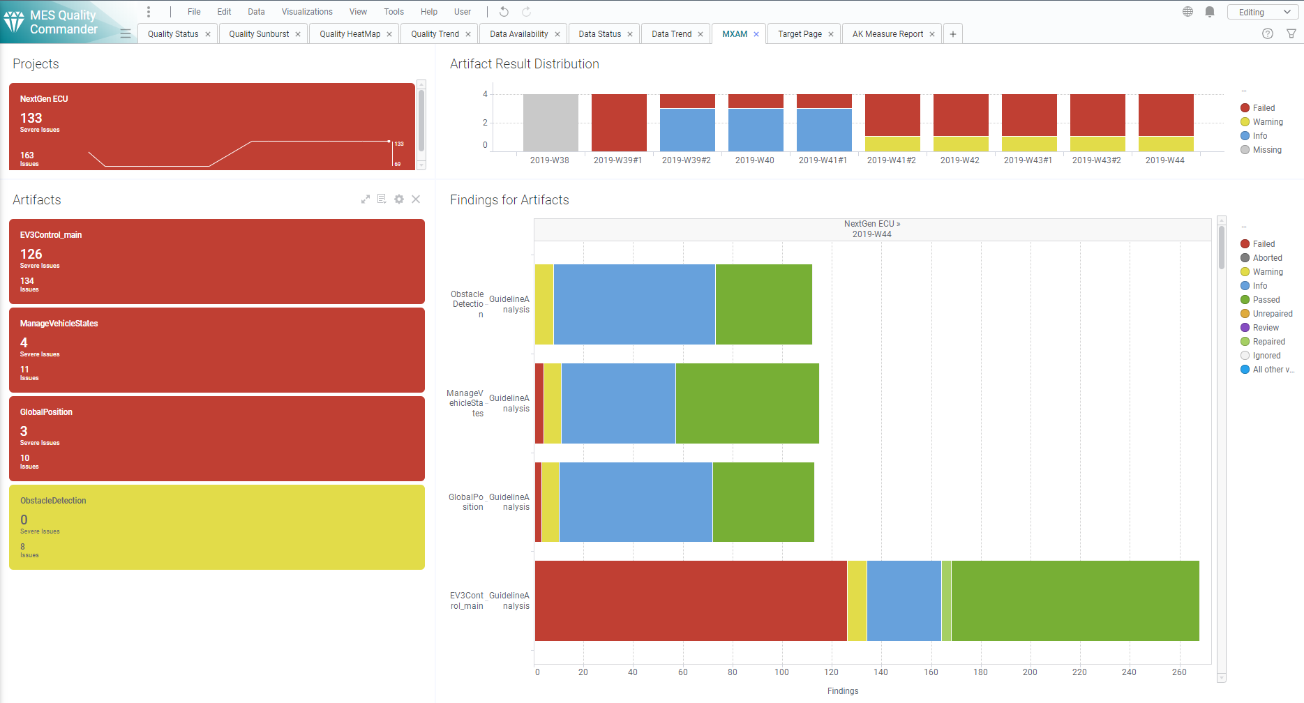
Figure 10.1 MXAM Details Page showing Findings per Artifact and Revision
The main visualization (horizontal bar chart) shows for each artifact all
findings based on FindingCount (e.g. Failed, Passed, Warning etc.
as provided by the MXAM report). As long as data for multiple revisions is
imported and no particular revision is marked respectively, the visualization
offers to scroll between revisions to get the finding status for a certain
point in time.
The Artifact KPI on the left-hand side shows a tile for each artifact colored
according to the worst finding result for this artifact (using the MXAM results
order), i.e. in Figure 10.1 all artifacts have failed checks,
but no findings for Canceled, Aborted or Review. So, all tiles are
colored red.
The MXAM result coloring is shown in the following figure:
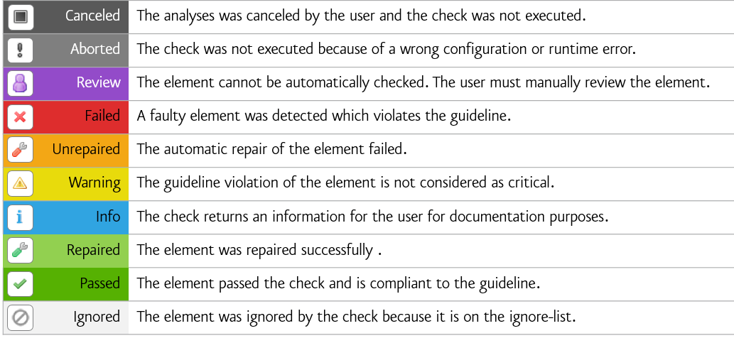
Figure 10.2 List of all existing MXAM results
Additionally each tile shows per artifact:
the number of severe issues (sum of
Aborted,Canceled,Failed,ReviewandUnrepairedfindings)the number of issues (servere issues plus
Warning)
The Project KPI chart on the top-left of the page shows the color of the worst finding over all artifacts as well as the number of severe issues and issues summed up over all artifacts.
The distribution chart (top-right) shows for each revision the number of
artifacts binned according to their worst findings. For the example in
Figure 10.1 this means there are four artifacts in total, all
of them with Failed findings.
By these means the user gets an overview on
how many findings per artifact exist
which findings per artifact exist
what are the worst findings to concentrate on first (for each artifact and for the whole project)
and how this has evolved over time (e.g. from project start time until actual date).
10.5.2. MXRAY Tool Page
Besides the standard data and quality pages, MQC provides an additional tool page showing details on data provided by MXRAY.
From dialog of the menu check MXRay under
title to add the MXRay tool page.
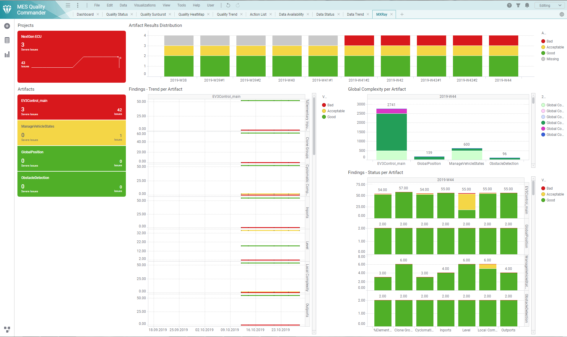
Figure 10.3 MXRAY Details Page showing Findings in Trend and Status and Global Complexity per Artifact and Revision
This page contains three main visualizations:
Global Complexity per Artifact
Status of subsystem results per base measure and Artifact
Trend of subsystem results per base measure and Artifact
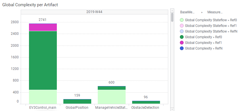
Figure 10.4 MXRAY Global Complexity per Artifact
The Global Complexity visualization (Figure 10.4) shows for each artifact the stacked values of Ref0, Ref1 and RefN for the stateflow parts of the model and the model as a whole, where:
Global Complexity->Ref0 is the global complexity of the model itself excluding all referenced libraries resp. models
Global Complexity Stateflow->Ref0 is the same as above but calculated only from the Stateflow parts of the model
Global Complexity->Ref1 includes the global complexity of referenced libraries/models exactly one time (each library/model is counted once)
Global Complexity Stateflow->Ref1 is the same as above but calculated only from the Stateflow parts of the model
Global Complexity->RefN includes the global complexity of referenced libraries/models whereas a complexity value is added for each occurence (each library/model may count multiple times depending on how often a library/model is referenced)
Global Complexity Stateflow->RefN is the same as above but calculated only from the Stateflow parts of the model
The global complexity visualization shows the values for all the variables stacked on each other, which means the lower elements are subsets of the elements stacked on top of it. Thus each element only shows the difference from all the elements stacked below it.
Ref0 (as shown) = Ref0 (as measured) - Stateflow Ref0
Stateflow Ref1 (as shown) = Stateflow Ref1 (as measured) - Ref0 (as shown) - Stateflow Ref0
Ref1 (as shown) = Ref1 (as measured) - Stateflow Ref1 (as shown) - Ref0 (as shown) - Stateflow Ref0
Sateflow RefN (as shown) = Stateflow RefN (as measured) - Ref1 (as shown) - Stateflow Ref1 (as shown) - Ref0 (as shown) - Stateflow Ref0
RefN (as shown) = RefN (as measured) - Stateflow RefN (as shown) - Ref1 (as shown) - Stateflow Ref1 (as shown) - Ref0 (as shown) - Stateflow Ref0
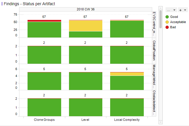
Figure 10.5 MXRAY Subsystems Results Status per Base Measure per Artifact
Figure 10.5 shows reported results per base measure per artifact. The user gets an overview on how many subsystems per artifact are stated good, acceptable or bad for all metrics provided by the imported report, e.g.:
Local ComplexityLevelCloneGroups(GoodandBadonly, see adaptation of clone group values as previously described)
Note
As long as data for multiple revisions is imported and no particular revision is marked respectively, all status visualizations (bar charts) offer the option to scroll between revisions.
The third main visualization showing the trend of subsystem results (see Figure 10.6) shows the same metrics as listed above, but rather its evolution over time than the status for a certain revision.
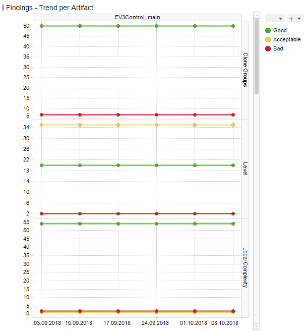
Figure 10.6 MXRAY subsystem results Trend per Base Measure per Artifact
With that the user is able to see the number of good subsystems that increase during the project runtime while the number of acceptable and bad subsystems decreases. It is also possible to detect an increase of the overall number of subsystems per model at a certain point in time (e.g. if a model was extended during development).
If there are multiple selected artifacts (or no specific one), the user is able to scroll between artifacts to see the trend figures for a particular artifact.
The Artifact KPI on the left-hand side shows a tile for each artifact colored according to the number of found severe issues or issues, respectively.
Severe Issues:
Sum of all
Badmeasures per artifact.Issues:
Sum of all
BadANDAcceptablemeasures per artifact.
If there is any Severe Issue, which means a base measure (e.g. Level or
Local Complexity) with a variable value of Bad > 0, the artifact tile
is colored red.
If there are no Severe Issues, but Issues (which means a base measure
with a variable value of Acceptable > 0) are found, the artifact tile is
colored yellow.
All other artifact KPIs are colored green.
The Project KPI chart on the top-left of the page shows the color of the worst result over all artifacts as well as the overall number of Severe Issues and Issues for the whole project.
The distribution chart (top-right) shows for each revision the number of artifacts binned according to their worst result.
By these means the user gets an overview on
the global complexity of each artifact compared to all other artifacts
how many issues (e.g. subsystems with problems) per artifact exist
which issues per artifact exist (e.g. subsystems with bad local complexity)
what are the worst issues to concentrate on first (for each artifact and for the whole project)
and how this has evolved over time (e.g. from project start time until actual date).
10.5.3. MTest Tool Page
To dig more into details from the Base Measures and Quality properties of the MTest tool, MQC provides an additional MTest Details page.
From dialog of the menu check MTest under
title to add the MTest tool page.
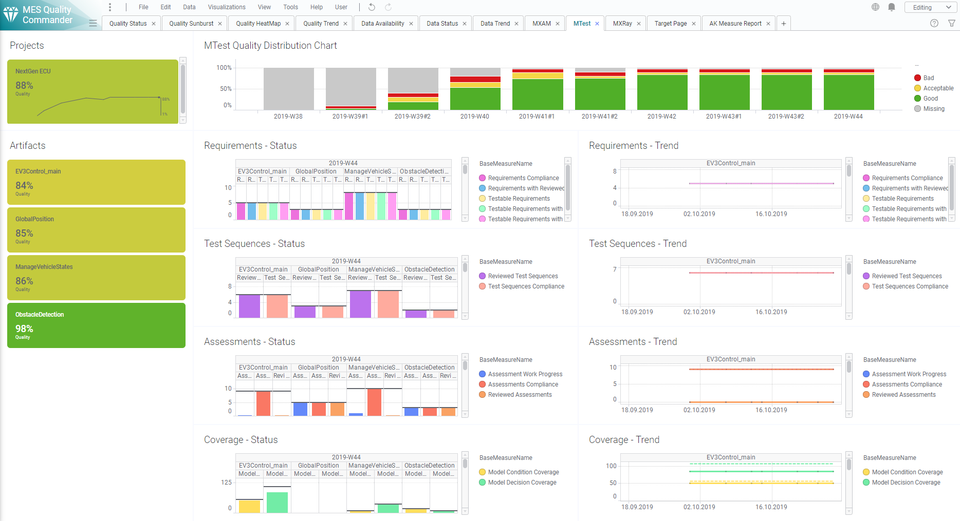
Figure 10.7 MTest Details Page showing Trend and Status
The visualized data is structured by
Requirements
Test Sequences
Assessments and
(Structural) Coverage.
For each Base Measure MTest provides two values, read and visualized by MQC:
Total, e.g. the total number of reviewed Test Sequences, andReached, e.g. the actual number of reviewed Test Sequences
Both values are shown in Status (see Figure 10.8) as well as in Trend (see Figure 10.9).
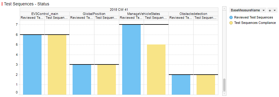
Figure 10.8 Measure Status visualization for Test Sequences
Each status diagram shows the Reached values of the imported base measures
as bar charts per artifact. The Total values are shown as horizontal line
(i.e. like a target to be reached) for each measure bar.
As long as data for multiple revisions is imported and no particular revision is selected respectively, MQC offers to scroll between revisions. The Artifact KPI selector (on the left-hand side) is used to limit the shown data for particular artifacts.
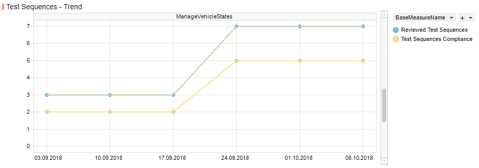
Figure 10.9 Measure Trend visualization for Test Sequences
Each trend diagram shows the Reached values of the imported base measures
as a trend line over revisions per artifact. The Total values are shown as
an additional dotted line (i.e. like a target to be reached) for each shown
measure trend.
If multiple artifacts (or no specific artifact) are (is) selected, the user is able to scroll between artifacts to see the trend figures for a particular artifact.
Artifact KPI selector (left-hand side), Project KPI selector (top-left) and Bin Distribution chart (top-right) are showing quality as on the MQC quality pages.
By these means the user gets an overview on
the progress of the functional tests
the current status of the functional tests
certain Artifact(s)
a certain test area.
10.5.4. Polyspace Tool Page
MQC provides an additional tool page showing details on data provided by Polyspace.
From dialog of the menu check polyspace under
title to add the polyspace tool page.
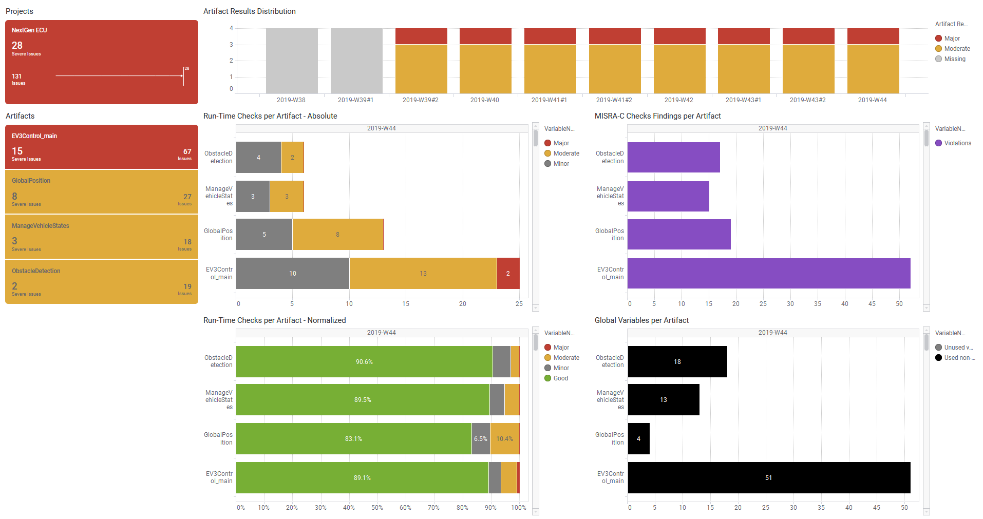
Figure 10.10 Polyspace Details Page
This page contains four main visualizations:
Run-Time Checks per Artifact - Absolute
Run-Time Checks per Artifact - Normalized
MISRA-C Checks Findings per Artifact
Global Variables per Artifact
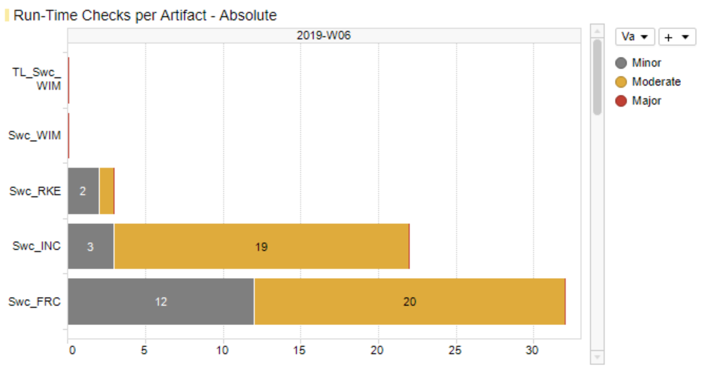
Figure 10.11 Polyspace Run-Time Checks per Artifact - Absolute
The first Run-Time Checks visualization (Figure 10.11) - top-left of the main visualization area - shows for each artifact the stacked absolute values of all findings excluding the number of green checks:
Run-Time Checks.Major(Number of Red Checks)Run-Time Checks.Moderate(Number of Orange Checks)Run-Time Checks.Minor(Number of Gray Checks)
This directly indicates the amount of still open and to be solved issues per
artifact without being concealed by a huge number of Run-Time Checks.Good.
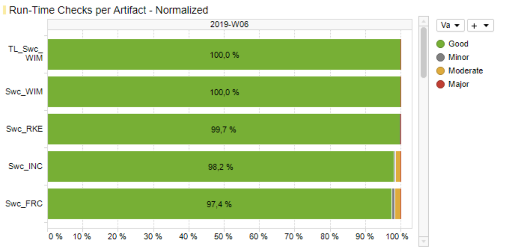
Figure 10.12 Polyspace Run-Time Checks per Artifact - Normalized
Figure 10.12 - at the bottom-left - also shows Run-Time Checks, but this time the relative share (in percent) of each result including the number of green checks compared to the overall number of findings per artifact.
The third main visualization (Figure 10.13) - top-right - shows the coding rule violations per artifact categorised as Mandatory, Required, Advisory and sum of all violations.
If a Polyspace report contains different types of coding rule checks other than
mandatory, required and advisory, e.g. additionally custom rules, all
violations found per artifact will be already summed up by the Polyspace
adapter to MISRA-C Checker.Violations and will be shown as one value on the
MQC data pages as well as on the Polyspace tool page.
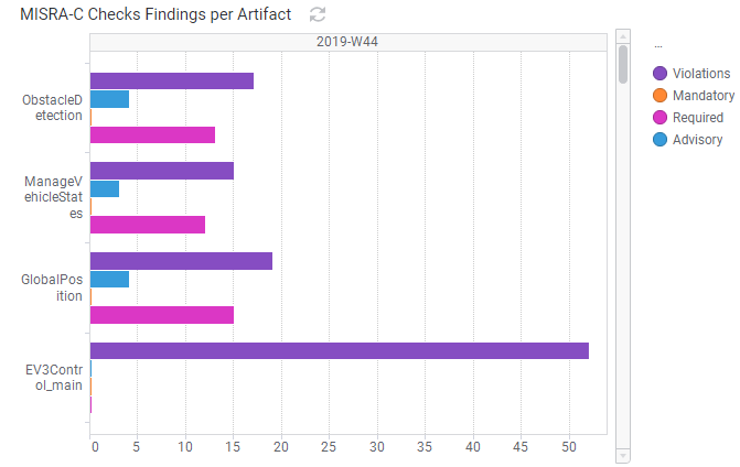
Figure 10.13 Polyspace Coding Rule Violations per Artifact
The forth main visualization (Figure 10.14) - bottom-right - shows for each artifact the stacked absolute numbers of global variables:
Unused variable(grey)Used non-shared variable(black)
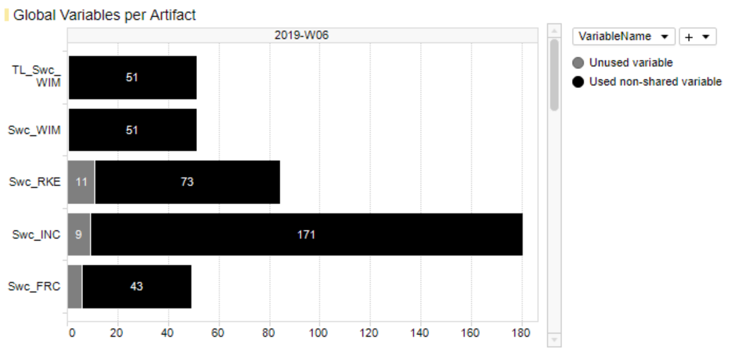
Figure 10.14 Polyspace Global Variables per Artifact
As long as data for multiple revisions is imported and no particular revision is marked respectively selected, all main visualizations offer to scroll between revisions to get the Polyspace results for a certain point in time.
The Artifact KPI on the left-hand side shows a tile for each artifact colored according to the number of found issues or severe issues, respectively.
Severe Issues:
Sum of all
Run-Time Checks.MajorandRun-Time Checks.Moderatefindings per artifact.Issues:
Sum of all
Run-Time Checks.Major,Run-Time Checks.ModerateandMISRA-C Checker.Violationsfindings per artifact.
If there is any Major finding, the artifact tile is colored red.
If there is no Major but Moderate finding, the artifact tile is colored
orange.
If there are no Severe Issues at all, but Issues (which means Violations >
0), the artifact tile is colored violet.
All other artifact KPIs are colored green.
The Artifact KPI on the left-hand side shows a tile for each artifact colored according to the number of found Severe Issues and Issues respectively. For the example in Figure 10.3 this means that within the current (last) revision there are four artifacts in total, one of them with severe issues (red bin), one with issues only (yellow bin) and two artifacts with no issues at all (green bins).
The Project KPI chart on the top-left of the page shows the color of the worst result over all artifacts as well as the overall number of Severe Issues and Issues for the whole project.
The distribution chart (top-right) shows for each revision the number of artifacts binned according to their worst result.
Note
Functionality of marking in Tool Pages is like data and quality pages which is describe in more detail in Marking section.
10.6. Color Schemes
As per default on Quality Pages (i.e. Quality Status page, Quality Sunburst page and Quality Trend page), MQC uses the traffic light color scheme:
Categorical Coloring |
||
|
Good |
All quality properties with an evaluated quality between 80% - 100% |
|
Acceptable |
All quality properties with an evaluated quality between 20% - 80% |
|
Bad |
All quality properties with an evaluated quality between 0% - 20% |
|
Missing |
Quality cannot be evaluated because of missing quality measure values |


The quality categories (bins) and colors for the categories may be adapted, see Quality Bin Configuration.
Additionally, as shown in Figure 10.15 MQC uses a gradient quality coloring for certain elements that have a computed or aggregated quality value assigned (e.g. for projects, artifacts and quality properties).
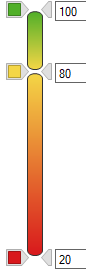
Figure 10.15 Gradient Quality Coloring used for elements that have a computed or aggregated quality value assigned
On Availability Pages (i.e. Data Status page and Data Trend page) MQC uses a blue coloring scheme. This means you can easily distinguish between available data in blue and missing data in grey.
Categorical Coloring |
||
|
Available |
Measure data is available for a certain revision |
|
Propagated |
Measure was missing, but could be propagated from previous revision |
|
Missing |
Measure data is missing for a certain revision |


Additionally, as shown in Figure 10.16 MQC uses a gradient availability coloring for certain elements that have an aggregated availability (e.g. for projects and artifacts).
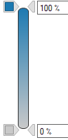
Figure 10.16 Gradient Availability Coloring used for elements that have an aggregated availability
10.7. Structure Levels
Projects of different sizes need different levels of abstraction, e.g. a number of artifacts can be grouped to a certain software component whereas the project itself then consists of multiple components. A user may not only be interested in checking the status of single artifacts. Rather, the user could like to observe the quality on higher levels in addition.
The structure levels give the option to view the same data in a more aggregated form on higher levels and to filter or mark the desired details.
MQC allows to set up structures for different items:
Artifacts (see Artifacts and Artifact Structure)
Quality Properties (see Quality Model Structure)
Measures (see Measures and Measurements)
To define an ‘Artifact Structure’, a project structure configuration has to be created (see Project Structures Configuration).
The ‘Quality Structure’ and ‘Measure Structure’ can be customized with a quality model configuration (see Quality Model Configuration).
Figure 10.17 shows the different levels of a quality model visualized using a Sunburst chart.
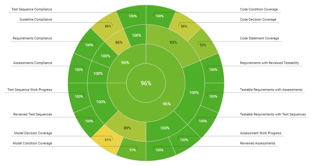
Figure 10.17 Quality Structure visualized in the Sunburst main visualiation
These defined and/or default structures for Artifacts, Quality Properties and Data Measures are visible in the filter panel and different visualizations (e.g. the Sunburst).
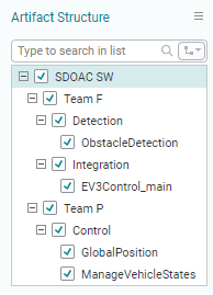
Figure 10.18 Artifact Structure in the filter panel
In addition, structure levels are also shown in KPI visualizations. These visualizations provide a level selection to modify the visible levels. It is also possible to expand selected (or all) levels to get a tree view. Click on [+] or [-] to expand or collapse a level.
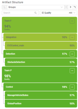
Figure 10.19 Artifact Structure in the KPI visualization
10.7.1. Level selection
Each of the KPI visualizations for artifacts, quality and measures allow to change the visible level of the structure within. The level can be changed by selecting the desired level with the dropdown or using the buttons on the left and right side of the dropdown (see QuickSwitch).
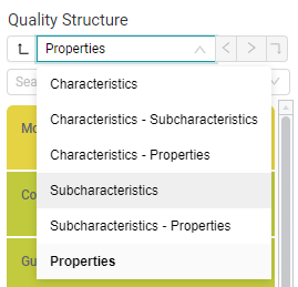
Figure 10.20 Level selection dropdown of the ‘Quality Structure’ KPI visualization
Selecting a specific level (e.g. ‘Subcharacteristics’ in the ‘Quality Structure’) changes not only the KPI visualization but also the main visualiation to this level.
The title of the main visualization changes depending on the level and shows the labels of its Axis.
The visualizations aggregate the values, based on defined weights, to show the quality or data to reflect the selected level.
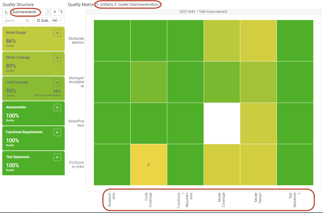
Figure 10.21 KPI visualiation and Quality Matrix main visualization with ‘Subcharacteristics’ level selected
Note
Typically, the weighted average of all lower element values, e.g. quality properties, is used for aggregation when selecting a higher level.
This does not apply to the Availability Matrix shown on the Data Availability page. Here, the color of the worst contained element result is shown on higher levels. For example, if at least one measure for an artifact is missing, the whole data source is shown as missing, too.
Note
On each structure level, elements with the same name are aggregated and are shown as one item. This also applies, if these elements belong to different higher level groups. By that, elements must not be unique inside the configured tree structure. If, for example, different teams are working on the same but also on different software components, it is possible to check the results for a whole component as well as for a team.
Additionally, it is possible to show different levels in the KPI visualization and the main visualization. By choosing a level combination in the dropdown (e.g. ‘Characteristics - Subcharacteristics’ in the ‘Quality Structure’) the KPI visualization will show the first level, while the main visualization will show the quality or data in the second level.
By using different levels in the KPI visualization and the main visualization, it is easy to mark specific structures of the quality or data.
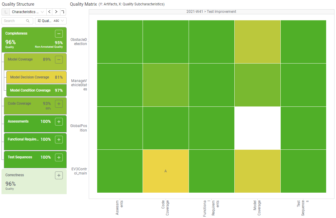
Figure 10.22 KPI visualiation and Quality Matrix main visualization with ‘Characteristics - Subcharacteristics’ level selected and part of the tree expanded
Besides the dropdown, the level selection contains additional buttons to provide a faster way to navigate the levels and switch between them.
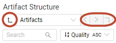
Figure 10.23 Quick Switch buttons on the ‘Artifact Structure’ KPI visualiation
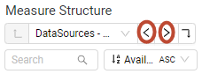
Figure 10.24 Quick Switch buttons on the ‘Measure Structure’ KPI visualiation
The up (leftmost) and down (rightmost) buttons change the structure level to the specific level one up or down inside the KPI visualization. The level shown in the main visualization changes accordingly.
The left and right buttons (between dropdown and down button, see Figure 10.24) allow to change the main visualization to a level equal or lower the one selected for the KPI visualizion. By using these buttons, the level for the KPI visualization is kept.
Example 1
If the level of ‘Artifact Structure’ is set as ‘Artifacts’ the down button is disabled, because there is no lower level. Clicking on the up button will change the level selection to ‘Elements’.
Example 2
If the level of ‘Measure Structure’ is set to ‘DataSources - Measurements’ clicking on the left button will change the level selection to ‘DataSources’ (one up from Measurements is DataSources). Clicking on the right button the level selection will change to ‘DataSources - Measures’.
By default the visualizations on the quality pages are configured to show the lowest level of the structure while the ‘Measure Structure’ on the data pages shows the Measurements level instead of the Measures level to give an better overview.
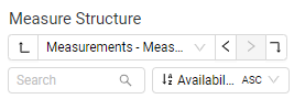
Figure 10.25 Toolbar of the ‘Measure Structure’ KPI visualization
10.7.2. Search and sorting
Below the level selection there is also a search and sorting feature to customize the visualization further to your needs.
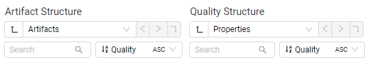
Figure 10.26 Toolbar of the ‘Artifact Structure’ and ‘Quality Structure’ KPI visualizations
Any search term is applied to the current level and the search result is directly shown in the KPI visualization while typing by removing all not matching elements. For details how to easily mark multiple search results, see KPIMarking.
The Sorting dropdown allows to adapt the order of the KPIs, i.e. sort by name or by value in both cases ascending or descending.
10.8. Marking
The purpose of marking is to restrict the shown data to the interesting parts.
The following should be considered while using marking:
When marking one or multiple elements of a visualization, the data that corresponds to other, not marked, elements are excluded from all visualizations.
As seen in Figure 10.28, by marking data in one visualization except the main visualization, only data representing this marking selection is shown in each of the other visualizations.
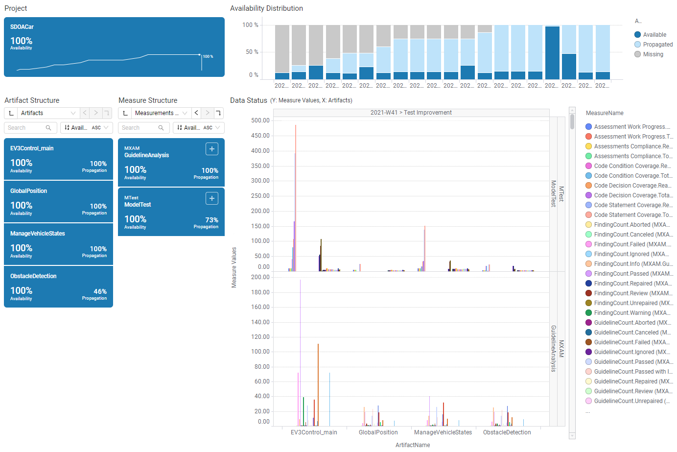
Figure 10.27 Data Status page without any marking
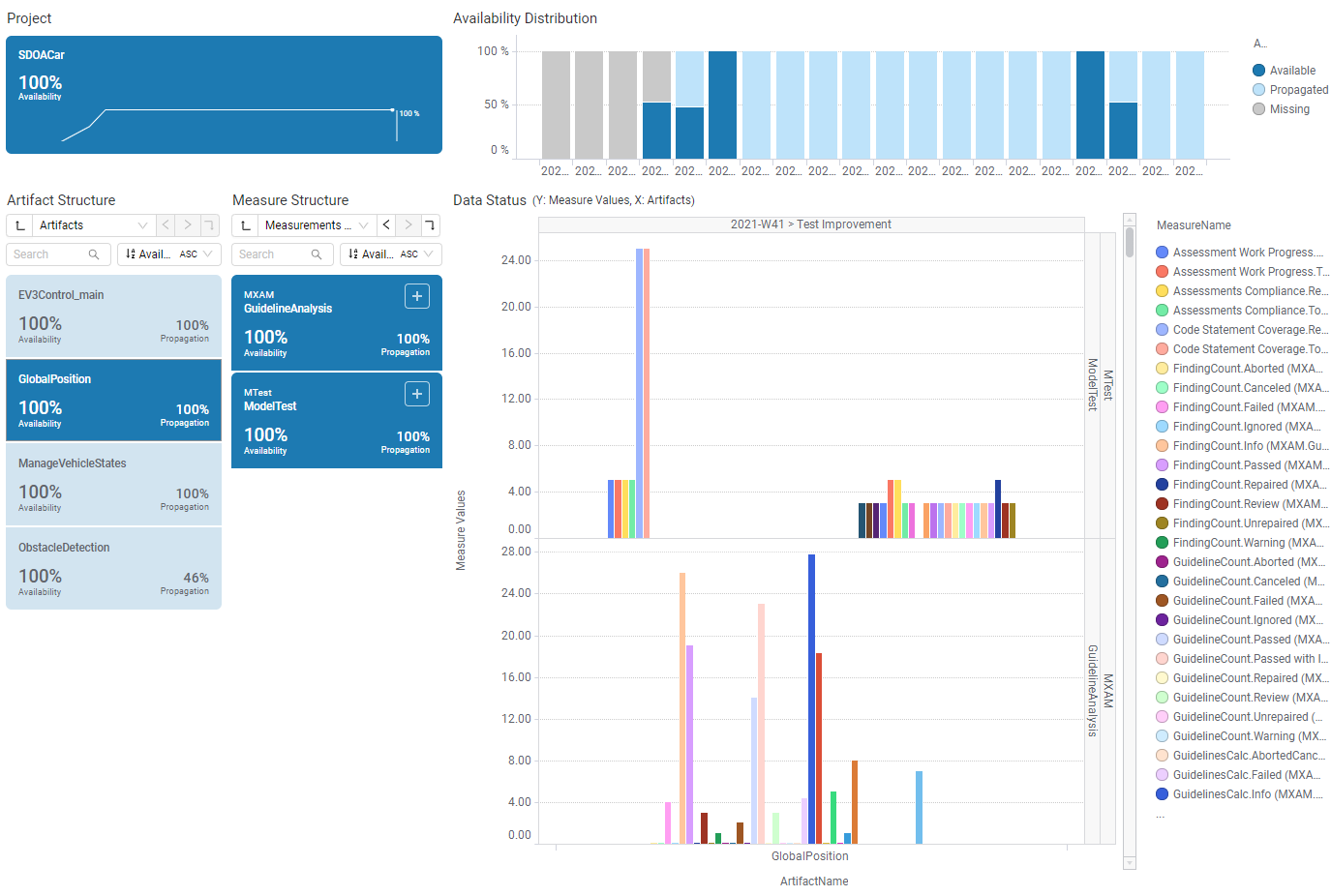
Figure 10.28 Using artifact marking on Data Status: All other visualizations show only data related to the selected artifact (GlobalPosition)
Please note that marking works cumulative. That means further marking without resetting will reduce the resulting set of data even more. To mark multiple elements in the same visualization, press and hold Ctrl before clicking on another element. It is also possible to draw a rectangle enclosing the interesting parts by clicking and holding down the mouse button. (e.g. in Distribution charts).
Resetting the markings can be achieved by clicking on the Project KPI tile.
On Status pages (Data Availability, Data Status, Quality Status, Quality Sunburst, Quality Heatmap) a revision is marked with just one click in the distribution visualization. With a second click a selected bin (e.g. a quality bin) is marked.
On trend pages (Data Trend, Quality Trend) quality bins can be marked for all revisions with one click.
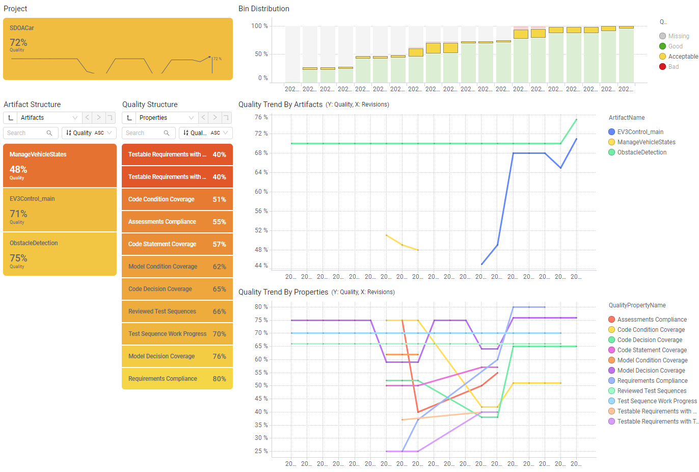
Figure 10.29 On the Quality Trend page the first click on an quality bin will select the respective quality bin for all revisions
Artifact and revision marking on a page will result in the same marking on other quality, data, action, and tool pages.
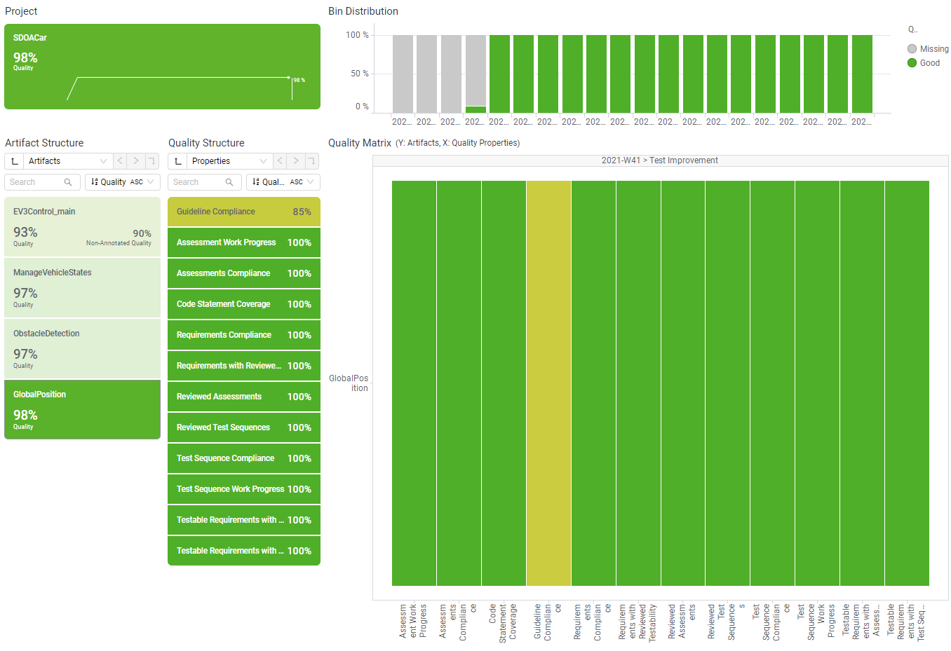
Figure 10.30 Quality Status page after marking GlobalPosition on data pages (see Figure 10.28)
After using the search feature of a KPI visualization the marking of the results can be achieved with clicking on the ‘Mark all visible’ button.
Holding ctrl to click the button marks the visible items in addition to an already existing marking. Holding ctrl and click again removes the selected element from the list of marked items.
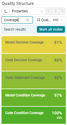
Figure 10.31 ‘Quality Structure’ searched for ‘coverage’